For this exercise the task was to take one picture for a tree, a child running/walking, and a building and experiment with different sizes and placements. Here are the finished pictures:


After completing the task there were some questions for contemplation:
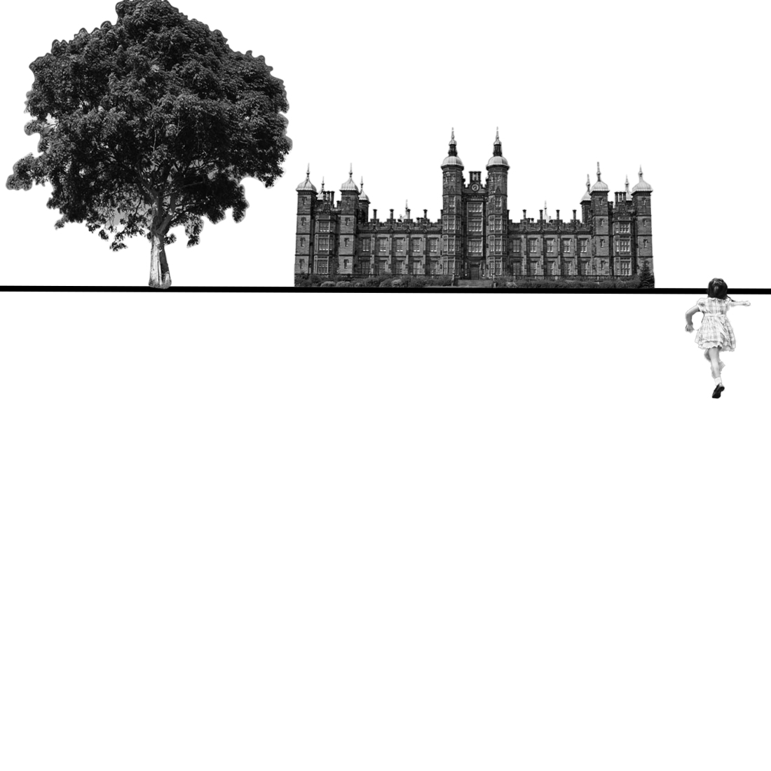
How does your sense of the image and its meaning change when the figure is smaller than the other elements? It makes me feel like everything is far away in the distance.
If the elements are at differing angles to each other and at an angle to the frame, what dynamic is suggested? I didn’t create a finished image using this, but I did experiment with it and it just seemed dizzying and I didn’t want to make things that didn’t mean anything just at random. I was thinking what it could mean but it just didn’t represent anything to me. Maybe this could be because of the specific images I was working with, like the tree photo is a bit angled and it affected some positions I moved it to, they didn’t look right but if the image had been taken level it might have looked much more acceptable.
If all the elements are completely horizontal and vertical in relation to the frame what dynamic is suggested? What is your opinion about this image and what sensation does it communicate? This feels much more realistic and grounded to me, and easy for people to understand as soon as they look at the image. As the information from this project stated:
- “Horizontals and verticals give a sense of balance, of order, of calm and of strength. Think of a building – if the sides and roof are horizontal and vertical it stands proud and won’t fall down.”
Perhaps also a little ‘normal’, maybe for advertisement an unusual angle or something ‘off’ about the image would draw viewers’ focus and make them give it a second look.
Which is your favourite composition? Explain why you feel it is most successful. My favourite composition was picture 6, I think the horizon line in this position is called a dutch angle in photography. It feels a bit more dynamic and gives a sense of movement to the image. It also gives me the feeling that I’m running behind the girl towards the building, too.
Reflecting on this exercise I must admit, I found it difficult. The actual making of the images was no problem, if it was fine to create random images. But trying to arrange the images in a way that meant something to me, whilst experimenting with angles was really difficult. They just looked laid out randomly most of the time. After I produced the above images, it took me a whole day to think about the questions because I just couldn’t find the answers. After thinking about it and coming back to look at the finished images a second and third time it felt much more clear, but I really just struggled with interpreting what my eyes were seeing. The information about composition in the project really made sense to me when I read it, and I had seen a couple of other students’ work after I was struggling to do anything more than the basic horizontal and vertical lines and I thought their work was really good and I could see what the goal was. Maybe using different source photographs would have produced different results.
I wouldn’t shy away from trying this in future as the difference you can see between the six pictures is amazing, even though the three figures are the same in each picture, but I feel like it would take me a longer time to become comfortable with this experimentation than the other activities I have tried so far.
