Exercise 4.1: Identifying tools and materials

For this exercise students are asked:

  1. Find a range of illustrators who use a particular medium.
  2. Catalogue and analyse the illustrators according to the similarities in their work.
  3. Choose one image and write about the way this illustrator works.
  4. Choose an image created for an earlier exercise and render it using the same tools and materials as the chosen artist.
  5. Choose a very different artwork and repeat the process.

I had no idea where to begin with this exercise. I feel like I can’t name many illustrators off the top of my head except those I found through instagram and I wanted to use this opportunity to expand my knowledge and keep working to push myself to experiment more.
From the choices suggested in the course material I naturally gravitated towards the traditional mediums but wanted to try something new and looked into the digital collage option.

Naturally, I started with a google of ‘digital collage artists’. One of the suggestions was Max Ernst which I found strange due to the fact that he lived 1891-1976. (I later discovered that Google had chosen to ignore the ‘digital’ in my search) I looked him up on Wikipedia and the first thing it mentioned was his creation of the frottage and grattage techniques where one scrapes a pencil over paper which has an object underneath, or the same but with oil and canvas instead of paper and pencil. I found this really interesting and different but could be a bit limited in some ways.

I returned back to the list of suggested artists and next was Hannah Höch (1889-1978). Höch was also a Dada artist like Ernst, and was one of the originators of photomontage.
These were interesting but I was interested in contemporary artists, too. I focused my search and found website page about a book on collage makers.
From this resource I found three artists: Damien Blottiere, Marcelo Monreal and Rocio Montoya.
These artist all use digital techniques to create portraits, with some using floral imagery to create the effect of flowers growing from the face.

The study material asked a few questions to encourage analysis of the artists’ work:
“How do they distort or exaggerate the representation of elements in their work?” I think this question is hard to answer in a specific way just by looking at their work, aside from the obvious photo editing software, but I did find a more detailed tutorial where an artist shows how to create a Marcelo Monreal inspired portrait:

This video really helped me to appreciate the details of what I at first considered a straight-forward image. Making the cut-out section of the face look 3D required a few smaller steps that make a huge difference to the finished piece.

The second question asks, “How do they communicate through use of metaphor or symbols?” Due to the nature of these digital collage artists’ work, I find this question difficult to answer because I don’t know much about portraits and feel that they are quite literal and flowers are added to make the image look more attractive. Some of Rocio Montoya’s images are more artistic than a straight-forward portrait, for example the image below:

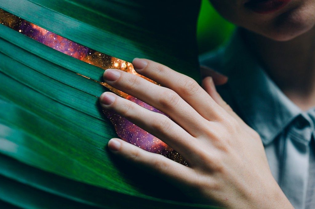
I felt a connection to this image; It made me think of nature, our connection to it and how we as humans affect things in nature on a larger scale. I noticed the angle of the ace and the hand are the same, and the lines of the shirt collar and finger draw my eye towards the leaf. I really appreciate the section of leaf lined up with the middle finger, it has been slightly altered to show a sliver of space and adds to the illusion Montoya is creating.

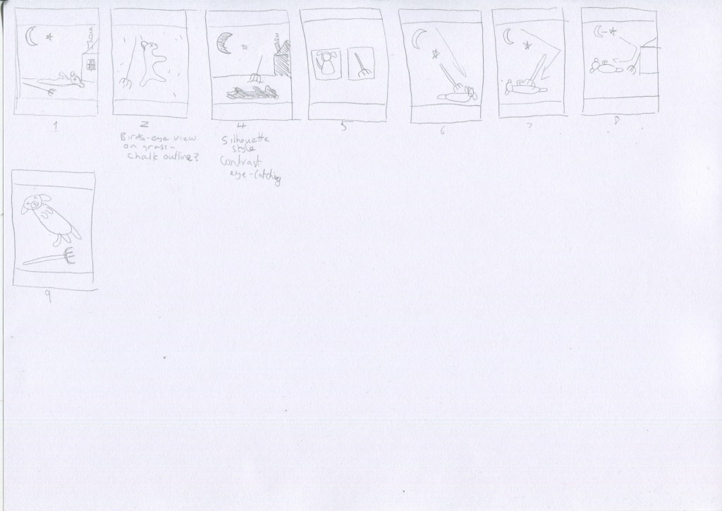
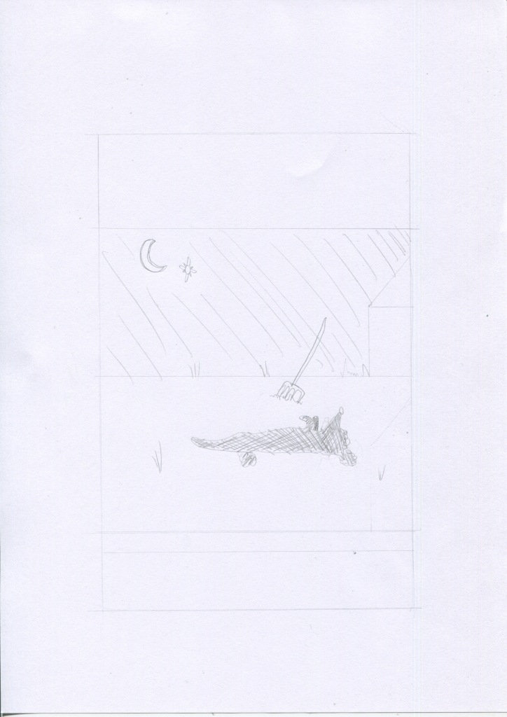
The next step in this exercise asks to recreate a previous visual created for an earlier exercise and to render it using the same tools and materials as the chosen artist. I went back to the beginning to one of my first exercises of producing the image of a hare in the style of another illustrator Katy Scott, with the final result:

Watercolour hare photoshop edit

I think this image will easily lend itself to the collage exercise. I started by looking again at Montoya’s website and portfolio. Most of the images are portraits and some of them are created with paper and then edited digitally, besides the other collages created by digital techniques alone. I think it’s hard to separate digital collage from traditional as they are mixed together often.

To begin the exercise I found an image similar to the original photo used for the original exercise:

Lepus europaeus (Causse Méjean, Lozère)-cropped.jpg

By Jean-Jacques Boujot from Paris, France – Lièvre brun / Brown Hare, CC BY-SA 2.0, https://commons.wikimedia.org/w/index.php?curid=37547558

I then edited the image following the tutorial and using my own photographs of freesias, and edited the colouring of the overall image also:

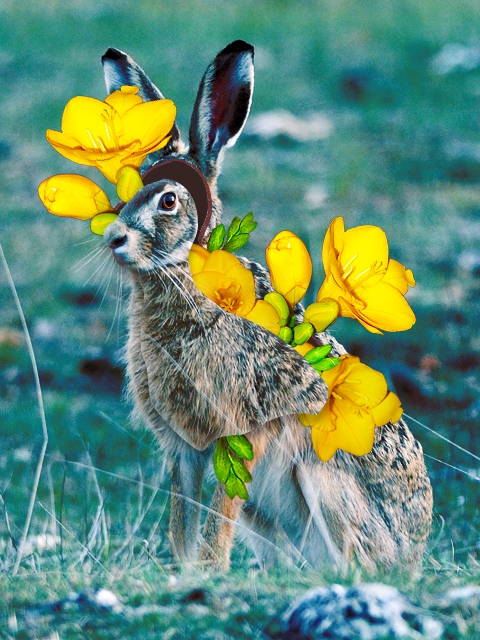
So as you can see, the completed image doesn’t match exactly the illustration I was trying to recreate. I found it difficult due to relying on photographs and trying to imitate the style of the artist, too. I think the overall idea is similar to the original illustration in that you can see ‘inside’ the hare where there are, not organs, but plants growing.

For the next step in the exercise I am to choose an artwork very different from the first image.
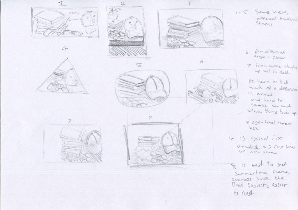
I decided on this illustration from Part 2:

As this man in the image is visally based on Clement Attlee, I took a photograph I found that is similar to the above image:

I then tore and scanned some pieces of paper and added some photographs of flowers I took to create the finished image:

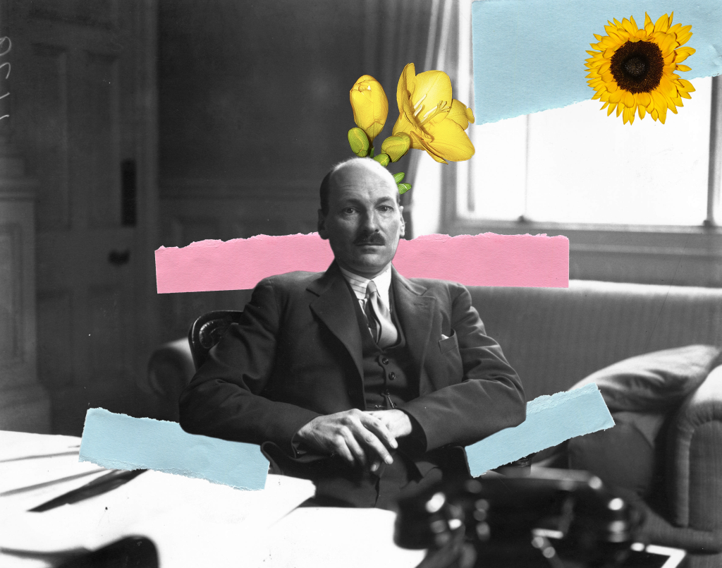
I remembered from one of the previous exercises that hot colours are foreground and cool colours are more in the background so I used the red paper to draw attention to his face as the focal point. I tried to create a path to lead the eye from the sunflower, along the paper to the freesia and then down to his face. I was also trying to keep the main feel of the original illustration which was connected to the portion of text, that the man in the room had negative feelings and things were bleak. I think his facial expression in the photograph matches this idea, although the flowers are slightly too happy. I tried altering the saturation but it looked wrong to me. I also tried to make the blue paper a bit more grey to help convey that bleak feeling more.

Reflection after completion of this exercise:
For the first image of the hare, I think I know now why they use people for this kind of collage! They don’t have fur! It looks much more realistic on people due to the smooth skin, but to do this with a furry animal, the fur would need editing more. It seemed quite straight-forward watching the tutorial video on this style of editing but it was really hard to follow.
For the second image I tried to include some scans of ripped paper which seems to be used by collage artists frequently. I feel like it might be a bit simple, but if I add more it might make the image too busy? I have a newfound respect for collage artist both digitally and on paper, after seeing some more process videos, I can see how much attention to little details it requires. I’m not quite sure I ‘get’ collage yet and look forward to trying this more in future.

References:

Rocia Montoya digital collage reference:
Rocio Montoya. 2020. COLLAGE DIGITAL – Rocio Montoya. [online] Available at: <https://rociomontoya.com/portfolio/digital-collage/&gt; [Accessed 4 September 2020].

Collage Makers II reference:
Amellcarolina.com. 2020. Carolina Amell – Collage Makers II. [online] Available at: <https://amellcarolina.com/collage-makers-ii&gt; [Accessed 31 August 2020].

Hare image reference:
Commons.wikimedia.org. 2020. File:Lepus Europaeus (Causse Méjean, Lozère)-Cropped.Jpg – Wikimedia Commons. [online] Available at: <https://commons.wikimedia.org/wiki/File:Lepus_europaeus_(Causse_M%C3%A9jean,_Loz%C3%A8re)-cropped.jpg#/media/File:Lepus_europaeus_(Causse_Méjean,_Lozère)-cropped.jpg&gt; [Accessed 2 September 2020].

Attlee photograph from:
Newstatesman.com. 2020. [online] Available at: <https://www.newstatesman.com/sites/default/files/styles/cropped_article_image/public/blogs_2017/05/gettyimages-3335361.jpg?itok=iESEuMej&gt; [Accessed 4 September 2020].

Assignment three: A poster

The brief for this assignment is to design an illustration for a poster advertising a music event. I chose to design one for a pop group rather than an early music concert or jazz evening as I think there will be a lot of freedom do do a bright illustration compared to my usual ones which don’t use many strong colours.
The first step was to brainstorm and create a moodboard.
I haven’t really ever looked at a music poster before so before starting I googled the subject to see a few examples and get a better idea of this topic.

I decided on Bon Iver in the end. First I looked at their website to check out their style. I took this and their other gig posters and put them into a moodboard:

Once I had got to this stage I felt I had gathered enough data to do a spider diagram:

LOTS OF TREES

I then moved on to the thumbnails with the idea of nature and especially pine trees in my mind:

I tried to keep things clean imagining what Bon Iver would actually use rather than my tastes.

I found that the trees weren’t working for me and anything I thought of mostly had already been done with them. I chose thumbnails 8 and 11. Thumbnail 11 is of a river system.
I then researched using Google to find a good arial shot of a similar picture and found this image on the National Geographic website. The picture is from NASA.

Society, N., 2020. Delta. [online] National Geographic Society. Available at: <https://www.nationalgeographic.org/encyclopedia/delta/&gt; [Accessed 16 June 2020].

The accompanying text is quite interesting:

A river moves more slowly as it nears its mouth, or end. The slowing velocity of the river and the build-up of sediment allows the river to break from its banks and develop new channels, called distributaries. This process is called avulsion. Here, the distributary network of the Lena River delta undergoes avulsion as it empties into the Arctic Ocean in Russia.

National Geographic

I found this subject really interesting and gave me a feel for how I would like to proceed with the illustration. So here are my two line visuals:

I wanted the river system to cover the entire page and to add the text on top so I added the text after I scanned the image using photoshop. Before completing the line visuals I favoured the leaf image but it didn’t look so interesting next to the river image so I chose to create the colour visual of the river:

I think it’s turned out ok, a few things to fix but it’s not bad. I used photoshop to add the colour. I chose the blue and green colours from the moodboard I produced earlier, but I think the blue may need to look a bit more blue as it almost looks a bit green especially in a smaller image like a phone screen. I sent it to my mum (of course) and she said it looked a bit green on her phone, too.
I also found an actual concert date for Manchester on Bon Iver’s website so I changed the date and time to match that.
In terms of title of the event, on Bon Iver’s actual concert posters they don’t give them a title so I wasn’t sure what to do about this but in the end I decided to produce another image for this option.
So let’s imagine that my mum is Bon Iver’s creative director or whoever is in charge of these designs. She sees the colour visual and says “No, it’s too green.” So I edit things again and submit my final design:

I then created an additional one with an example of where the event title could go but it looks like I have reached my upload limit for this website so I’ve had to awkwardly embed it from Flickr:

bon iver river4

The image is in high resolution and would easily be reproduced in an A3 size. It looks more like ice this way and the water is more blue. There is more contrast which helps to draw the eye. Listening to Bon Iver’s music again whilst looking at the finished illustration, I think it matches well too.

On reflection after finishing the poster I’m much happier with this illustration than my previous assignment! It did take ages but a lot of that time was spent looking at fonts, researching and planning and downloading Photoshop brushes. I shy away from colouring using photoshop so it was a bit out of my comfort zone. I definitely felt the pinch not using a Wacom tablet and would like to invest in one for future.
Looking back on the moodboard it looks a bit basic and I could have added some outside examples of the feel rather than Bon Iver’s other concert posters.
It threw me a bit to create something whilst having what the ‘client’ would like in the back of my mind and so I focused on what they had already used. I’m not sure where the illustrator’s style and what the client wants fit together. But overall, I’m happy with the image.

Exercise: Making a mock-up

This goal of this exercise is to mock-up a book cover.
The book I have chosen is called The Curious Incident of the Dog in the Night-Time. I have owned this book a long time and haven’t read it in years.
I first re-read the blurb.

The curious incident of the dog in the night-time is a murder mystery novel like no other.The detective, and narrator, is Christopher Boone. Christopher is fifteen and has Asperger’s Syndrome. He knows a very great deal about maths and very little about human beings. He loves lists, patterns and the truth. He hates the colours yellow and brown and being touched. He has never gone further than the end of the road on his own, but when he finds a neighbour’s dog murdered he sets out on a terrifying journey which will turn his whole world upside down.

The Curious Incident of the Dog in the Night-Time. Blurb

Noted at the bottom of the page: Cover illustration copyright Marc Boutavant; cover design copyright Suzanne Dean; hand lettering copyright Tim Marrs.
I gather from this that Suzanne Dean, whose job title is Creative Director (stated on her instagram profile as there was nothing in the ‘about’ section on her website) possibly created the client visual herself and then Marc Boutavant created the final illustration for it.
In any case, the next thing I considered was the brief that would have been given for this book cover.

So here is my attempt at the brief:
Create a book cover for The Curious Incident of the Dog in the Night-Time.
Follow the client visual provided by Suzanne Dean but in your own style. (Optional, to be included if she did make the visual)
Leave space at the top and bottom for text to be added later.
We want the image to perform the function of prompting curiosity and to draw people to it when they see the book on sale in stores.
Keep in mind this story is supposedly written by a teenage boy. This may influence style.

This is a murder mystery novel so I think something similar to the original illustration will be good.
Here is the cover of the book I have:

So I started. I thought first of all about doing a spider diagram but the parameters are more strict for this stage, so the next thing I moved on to was thumbnails. I used a vertical rectangle to keep the thumbnail the same proportions as the finished illustration and keeping this idea in mind- Victim: dog, murder weapon: rake, location of murder: Outside garden, and time of death: night-time.

Here are the thumbnails:

I chose to use thumbnail 4 as it would create contrast and be more eye-catching. I then made a line visual of this thumbnail layout:

I then thought about what materials to use. I have been trying to use different materials and wanted to avoid watercolours as I use them often. I decided to use watercolour pencils, take a scan and then add water and overlay the dry image onto the wet one to preserve texture.

Here are the wet and dry images:

I then used photoshop to edit the image and add the text:

I don’t currently own a printer so I was unable to test out a printed version but the digital image is in proportion to the book.
As you can see, the final image is quite different to the first drawing. I’m happy with the night sky and the house silhouette, I didn’t expect that to turn out so well. I’m a bit annoyed with the horizon line and I would have liked to use different font. I think the fonts I used were ok, I couldn’t find the perfect one to use so I will need to buy some more fonts.
I think there isn’t so much contrast as I originally hoped but it looks pretty!

Exercise: Client visuals

In this exercise the main task was to choose two finished illustrations and work backwards gradually creating more basic line drawings.

I used the book ‘Animal’ for the two illustrations. It is a very large, heavy book so I had a bit of trouble scanning it:

And here are my line drawings for Smokey Bear:

Next are the line drawing for the United States $10 Bill:

I made things hard for myself choosing currency as the whole point of the detail is to stop people copying it. Even in this simplified form it is still recognisable as a ten dollar note.
I found it fairly straightforward working backwards, and it was an interesting exercise in reading an image and working out what is the most essential aspect of it that gets the main point across and it has helped me to know more clearly what to look for when I see an illustration in future.
My last task was to find more images that show art direction and to explain the thinking behind them.

I picked two of Yuko Shimizu’s illustrations as I can see the art direction in a many of her illustrations.

SHIMIZU, Y., 2020. The Chronicle Of Higher Education #Metoo. [online] Yuko Shimizu. Available at: <http://yukoart.com/work/the-chronicle-of-higher-education-metoo/&gt; [Accessed 15 June 2020].

You Can see from the illustration above the message is very clear and instantly recognisable. This illustration was created during the Me Too movement and shows a professional business woman or office worker and the environment she is in. It gives you an instant feeling of what her own feelings are too, even though you can’t see her expresssion. I think showing the back of her head indicates that this is any woman. It represents many women in the workplace rather than a specific woman in particular.

SHIMIZU, Y., 2020. Boston College Law Magazine –The Shame Of Guantánamo–. [online] Yuko Shimizu. Available at: <http://yukoart.com/work/boston-college-law-magazine-the-shame-of-guantanamo/&gt; [Accessed 15 June 2020].

In the second illustration by Shimizu above, it doesn’t contain a wide range of content but once again the meaning is very clear, by his appearance we learn some information about the man, and the fact that he is looking directly at the viewer tells me there is a sense of responsibility they want you to feel, that you need to be aware of this problem and connect emotionally. The inclusion of the dove in the top right helps the composition as it draws the eye in a diagonal fashion along with the wire fence to point towards the man, and it gives a sense of freedom and lack of freedom, as the bird flies away over the fence, the man is left behind.

Reflecting upon completion of this exercise, it was fairly straightforward once I started as mentioned earlier but it took me a while to fully grasp the concept. I feel more like I know what I’m looking for now, and how I could quickly create client visuals that get the client’s message across clearly.
I found it easy to scale up the image but the line drawings were actually harder than I thought they’d be. I think I would prefer them to look more professional of course and will keep practicing this idea in future when I come across other illustrations.

References:

n.d. Animal: Exploring The Zoological World. Phaidon, pp.20, 222.

Exercise: Viewpoint

I have chosen ‘Summertime’ as my theme and used a cap, a couple of sunglasses, a face mask and some climbing and wildlife books, although this year’s summertime could be summed up with a tv and some pyjamas for those of us stuck at home because of that whole virus thing.

I took 30 photos but chose to put 12 here:

I tried placing the items in different positions and tried taking photos close up and at different angles and flash to try to improve the backlighting issue.

I then repeated the exercise with drawing rather than photos as instructed:

I chose the picture 8 layout and drew from life rather than a photo, and used the scaling system to recreate the thumbnail proportions for the larger image:

I think the image is successful although I asked my mum to guess the theme and she said outdoors which could also work, but outdoors is what summertime means to me, anyway.
In the course material we were asked a few questions:

Which viewpoint best fitted the word your objects illustrated? Why was this?
I feel that the eye-level (thumbnail 8) viewpoint worked best as mentioned earlier, the subjects of the books was clearly visible this way which allowed me to show different subjects and thus give more clues as to the theme.
Which format best illustrated your words?
I struggle to understand this question. Words as in my answer to the previous question? Words as in the theme word summertime? In terms of the best format I think the rectangular format worked best as it meant I could include the whole length of the books and the objects were arranged in a rectangular fashion. This allowed more information and as mentioned in my previous answer, more clues about the theme.
Did changing viewpoints make you think differently about your choice of objects and arrangement of them?
Some of the photos show a neater arrangement which seemed ok whilst I was taking photos from a lower angle, but when I began taking photos from above it showed it wasn’t a visually pleasing arrangement because of the bare space on the desk and it didn’t feel like a great composition.

Now that I have completed the exercise I am relieved. I found it hard to decipher the individual steps required to complete it and the thumbnails took me a while to do. I’m happy though because this exercise gave me a chance to draw from life rather than a photograph which is one of the things I received in the part 2 feedback to work on. It was a workout for my brain but I definitely need a lot of practice in this area! There also ended up a fair amount of space in the picture above and below the objects which isn’t great. I will look out for this next time.

Exercise: Giving instructions

I chose ‘Making a cup of tea’ for this exercise on instructional illustrations.

I first looked around my house for reference materials. There were no illustrations on the tea boxes I had but I had this book for different kinds of coffee:

Jobst, M., n.d. Coffee Drinks. pp.50, 55, 60.

I finally have applicable reference material in my house! This is the first exercise where I actually have paper references that I can use. I like these illustrations as they are showing the coffee in a diagrammatic way and they show the temperature by use of colours and shapes. I like the simplicity and clarity of the 2D shapes.

There weren’t many illustrations available when I googled ‘how to make a cup of tea’ but there were a few in a style such as the example below:

https://www.ochaandco.com/pages/how-to-make-green-tea

The illustration above uses a nice homely style which I think is a great choice for this kind of subject. Even the background looks like tea-stained paper, and the illustrations could stand alone without text.

The information I need to impart is quite straightforward the essential things are communication that the water needs to be hot and there needs to be a teabag in the cup! Extras would be things like milk and sugar and an order to the steps. The illustration above uses 7 steps but I think we can reduce it to 3 steps at the least.

The next step was to work out how much space on the paper is needed for each step and how to display them. The course material mentioned to try as many possibilities as you can. Here are the different layouts I tried. Most of the layouts could be used to get the point across but it took a while to make a nice looking one.

I then made a final draft for the layout I wanted to use:

Drew it again on watercolour paper and used watercolour pencils but I didn’t add water to it:

I added the yellow lines next to the cup to both add feeling and aid with the composition to point towards the instructions. It crossed my mind to add writing below for the ingredients but I think people will know to use sugar rather than salt!
Finally, I edited the image in photoshop:

On reflection once I finished the image I felt like some things didn’t stand out much, such as the tea bag in the cup. I tested out a new style of marking which worked well for the water coming from the kettle but other things like the actual kettle would have benefitted from a solid colour. Even the earlier pencil image looks cleaner and easier to understand. But at the very least it gets the point across! It was an interesting process, too.

Exercise: Abstract illustration

For this Exercise I was asked to listen to a piece of instrumental music. I chose the artist Miles Davis. I like this genre of music but I didn’t know off the top of my head any Miles Davis songs so I went to Spotify and played the first song on the top 5 list, which was Blue in Green. I listened to the other songs but found myself drawn back to this song.

Here are my first mark-making images I made whilst listening to the music:

The music quickly gave me the impression of a slow flowing river or calm waters, but the trumpet was very sharp-sounding. I used a sponge roller with black ink to make the texture in the image above to represent the kind of static noise you can hear through most of the track. Again this reminded me of a flowing river sound, like running water. Taking a step back and looking at it, the adjective I came up with was ‘slow-moving’.

I wondered what the title meant and googled it. There was a discussion on Reddit as to what it could mean that really helped:

The idea of blue and blues music being connected to feeling sad is very common, and so green makes sense to represent envy or jealousy. I felt like sharpness definitely fit in somewhere amongst the slowness and roundness of everything else.

I chose this square to work with and I included some of the ink marks:

This is what I came up with whilst still listening to the music:

I then edited the image using photoshop keeping in mind the idea of it being used as a CD cover for the song:

I liked that the shapes intersected, I’m not sure how I feel about the watercolour pencil texture as it can seem a bit crayon like and I don’t know if that texture is suitable for this genre of music. Most of the album covers for this genre tend to just be a picture of the musician.
I felt that the sharp red shapes could represent pangs of pain as well as the sharpness of the trumpet sound. The green bar intersecting with them also reminds me of sheet music, as did the whole image I created before focusing in on the square section.
Listening to the music one more time after I completed this image, I feel like the music gives off a darker or dimmer atmosphere than my image does overall, maybe darker colours would have worked better.

On reflection I feel proud of this image because I was quite worried about this exercise and didn’t expect it to turn out as good as it did. The success is of course due to the guidance in the course material and I feel like I have learned a lot from this exercise. I am also aware that it kind of looks like a face. Oops.

Exercise: Image development

For this exercise I was asked to make 10 edited versions of an image by using ‘L’ shaped card to look at how cropping an image can affect the story it tells.

I found this image by Pieter Bruegel the Elder called Hunters in the Snow. It has so much detail and appears to show a group of hunters returning from a rather unsuccessful hunt, all looking a bit weary. As you can see the left of the image contains the foreground while the right of the image contains the background.

Pieter_Bruegel_the_Elder_-_Hunters_in_the_Snow_(Winter)_-_Google_Art_Project.jpg

En.wikipedia.org. 2020. The Hunters In The Snow. [online] Available at: <https://en.wikipedia.org/wiki/The_Hunters_in_the_Snow&gt; [Accessed 27 April 2020].

I first looked at the overall composition:

comp study.jpg

And then used the L-shaped card to study different sections of the image and cropped to make the following images below. I also have included a word with each image as instructed:

crop1.jpg
Crop 1 – Village
crop2.jpg
Crop 2 – Return
crop3.jpg
Crop 3 – Skating
crop4.jpg
Crop 4 – Hunt
crop5.jpg
Crop 5 Flight
crop6.jpg
Crop 6 – Play
crop7.jpg
Crop 7 – Height
crop8.jpg
Crop 8 – Work
crop9.jpg
Crop 9 – Welcome
crop10.jpg
Crop 10 – Journey

I have chosen to create an illustration on cropped image 9 “Welcome”. I think this image can easily convey a feeling of warmth and coziness on a freezing cold winter day. When I looked at this image I was reminded of the exercise ‘reading an image’, the dragon in the cave and cold colours versus warm colours and how to use textures. Looking at this image I began thinking about textures and what opportunities this image provided to use textures as I feel this is a real weak point of mine. What mark-making techniques could I use to portray various textures?

I made a list of different mark-making techniques to create suitable textures for this image:
Trees, bark, grainy – stippling, dry brush
Snow – dappling
Bricks, rough – dry brush, cross hatching
Clothing, fabric – smooth
Icicles – smooth wet look
Fire – smooth – similar to water

With these in mind I began with thumbnails:

I was happy with the first thumbnail but as I am working on experimenting and research throughout the entire project I tried a couple more and actually ended up using the third thumbnail for the final image.

I then made a draft of the full image using layout paper:

Then an ink copy on watercolour paper:

Then I scanned the image and added colour and the ‘Welcome’ text:

As you can see, I have copied a couple of figures from the original painting I was working with. I really liked how the artist used the strong contrast of the dark clothing against white snow and fire so I tried to replicate that and the interesting stances of the people. I tried to make colours cold for the outdoors and warm for the building and fire to encourage that feeling of welcoming warmth coming in from a bitterly cold day. The style I chose was entirely based on the word ‘welcome’ and what style of illustration I would expect to accompany this word. My first thought was hotels and places connected to tourism so I tried to make it light and friendly. Once I finished the colouring I then thought about the font, and googled the word welcome. I wasn’t surprised to see a lot of classical-looking fonts which did give a feeling of coziness but when I tried them on the image it looked wrong and disconnected from the image. Since the artwork itself gives me a kind of rounded bubbly kind of feeling I then tried the current font you can see in the image and found that it worked much better. I chose a warm colour again to encourage that warm feeling I want the image to convey.

Upon reflection I feel happy with the final outcome, I would have loved to experiment with oil pastels but I didn’t have the right paper that would work with it. I was also disappointed a bit with how the ink lines look against dark colours so I felt a bit restricted at times with my colour choices. Removing a white background can take time and I also missed a couple of steps in this process as it has been a while since I did this. I would have liked to try more mark-making techniques and was looking for opportunities to do so whilst making the image but the mediums I used didn’t really lend themselves to it. Besides these issues I’m happy with the outcome and how the text fits with the image. I also thought it would be nice to add a second and/or third language to the text as the word is often seen along with other languages in day-to-day life but left it off just in case.

Part 2 feedback reflection

There’s a lot to unpack here!

I’m very happy having received feedback, I feel like I have some guidance and structure to follow going forward onto part 3. One of the things that stands out the most from all the exercises is thorough research, not just at the beginning but to keep thinking carefully right through to the end of the exercise. I think once I get the initial idea I focus on that and don’t think any further about other possible ideas.

Observational drawing was another point that stood out, I would like to do more observational drawings and I can see the benefit having done observational drawing outside of this course, there are many more things you can pick up from looking at the object in person than from even an extremely detailed photograph. I’ll work on doing this more.

The mark making feedback was really interesting I would have never considered using material from the kitchen because it related the cake, it was really eye opening! It’s like trying to find and take advantage of any opportunity to communicate your ideas. This helped me a lot. “Always consider relationship between subject drawn and materials to communicate idea.”


For the black and white exercise and from others too, I think I need to invest in a printer as soon as I can. Investigating linocut, woodcut and etching techniques is sounds great although I have never tried any of those techniques and don’t know where to start with them so that will be interesting!

Reflection on the point of sale assignment feedback, there were a few questions to consider:

Did you consider researching illustrators/ artists that draw fresh produce, for inspiration regarding style and compositions? I did happen upon an illustrator who used watercolour to produce food illustrations but it wasn’t something that impacted my ideas because I had already decided to use watercolour at that point. I forget the name of the illustrator now, but I wasn’t specifically looking for other illustrations and this is a really good tool to have in the toolbox. I will definitely use this in future.

Did you consider researching examples of point-of-sale signs? I had this idea in mind when I first went to the Waitrose website, but they had just used photos of the actual fruits and vegetables and then I got distracted by other things. Writing things down would have helped a lot in this instance!

What text could be added to the illustration, design layout of text and image together, what type style would you choose? I thought about adding text but I felt that adding text would be a failure of illustration where the image is responsible for putting the point across. I thought a few times that in an actual supermarket, as far as I can remember, there are always bits of text on or around images they display. Glad to know this is an option for future illustrations! I also really like the advice: “how will the point-of-sale units be displayed for example hanging high in a supermarket aisle or over the actual display of fruit and veg? You could show this pasting your designs onto a supermarket image, using Photoshop.” This is really good and helped me think in practical, day-to-day, common sense terms. Another eye opening point.

There are so many things from the feedback that I found helpful, I worry I won’t be able to remember them all! I’m really looking forward to putting them into practice for part 3.

Exercise: Reading an image

The exercise was to study an image and practice analysing the colours and hierarchy in the image and to answer the following questions:

  • What the image is about. What is it saying?

It looks like it might be from a story, maybe a turning point or climax where the characters in the picture have reached a dangerous situation and are debating how to progress.

  • Work out the narrative and identify the story.

There is a dragon sleeping in a cave, guarding it’s treasure while a couple of children are arguing about what to do. The girl seems to be pointing towards the treasure, possibly the chair whilst the boy is pointing in the opposite direction, which looks like the way out of the cave. They don’t look like soldiers or knights of any kind.

  • Describe the palette and tonal range which has been used. Note if the colours are hot or cold, whether the elements are detailed or textural, and where these approaches are used.

The colours used in the image are blues and purples which are cold and then reds and oranges which are hot colours and they are dominant in the image and draw the eye. The blue cave wall has a wet look texture and the blue gives the feel of a cold, damp cave but the dragon and the torch being carried by the girl look hot and cozy. The cave floor is textured to look like stone, also blue and looking cold.

  • Is there any connection between hot colour and the importance of the element in telling the story? Begin to identify the hierarchy within the image. Which are the most important elements in terms of carrying the narrative or conveying the ideas and how have these been treated?

There are splashes of bright green that are like highlights that draw the eye from left to right from the discarded weapons and armour in the bottom left corner to the centre of the picture where a type of throne or chair sits, guarded by the dragon. The dragon’s tail forms an arrow that points towards the chair, too. The first thing the eye is drawn to is the dragon, and then the detail of the story emerges as your eye then moves to the green, whilst the blue sits in the background and gives an overall feel to the environment.


I don’t feel very confident in my study of image composition and reading images but I do enjoy studying this topic, I find it fascinating and I look forward to improving this skill.