Exercise: Making a mock-up

This goal of this exercise is to mock-up a book cover.
The book I have chosen is called The Curious Incident of the Dog in the Night-Time. I have owned this book a long time and haven’t read it in years.
I first re-read the blurb.

The curious incident of the dog in the night-time is a murder mystery novel like no other.The detective, and narrator, is Christopher Boone. Christopher is fifteen and has Asperger’s Syndrome. He knows a very great deal about maths and very little about human beings. He loves lists, patterns and the truth. He hates the colours yellow and brown and being touched. He has never gone further than the end of the road on his own, but when he finds a neighbour’s dog murdered he sets out on a terrifying journey which will turn his whole world upside down.

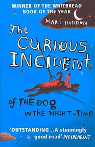
The Curious Incident of the Dog in the Night-Time. Blurb

Noted at the bottom of the page: Cover illustration copyright Marc Boutavant; cover design copyright Suzanne Dean; hand lettering copyright Tim Marrs.
I gather from this that Suzanne Dean, whose job title is Creative Director (stated on her instagram profile as there was nothing in the ‘about’ section on her website) possibly created the client visual herself and then Marc Boutavant created the final illustration for it.
In any case, the next thing I considered was the brief that would have been given for this book cover.

So here is my attempt at the brief:
Create a book cover for The Curious Incident of the Dog in the Night-Time.
Follow the client visual provided by Suzanne Dean but in your own style. (Optional, to be included if she did make the visual)
Leave space at the top and bottom for text to be added later.
We want the image to perform the function of prompting curiosity and to draw people to it when they see the book on sale in stores.
Keep in mind this story is supposedly written by a teenage boy. This may influence style.

This is a murder mystery novel so I think something similar to the original illustration will be good.
Here is the cover of the book I have:

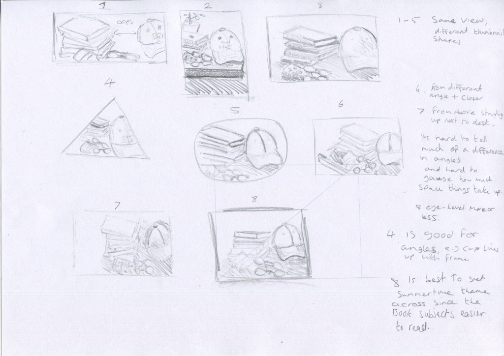
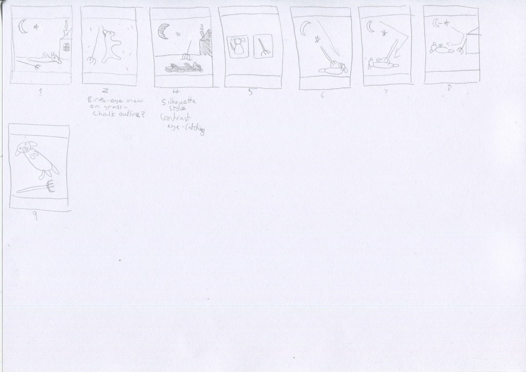
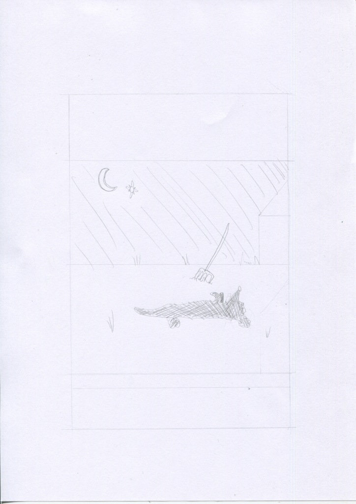
So I started. I thought first of all about doing a spider diagram but the parameters are more strict for this stage, so the next thing I moved on to was thumbnails. I used a vertical rectangle to keep the thumbnail the same proportions as the finished illustration and keeping this idea in mind- Victim: dog, murder weapon: rake, location of murder: Outside garden, and time of death: night-time.

Here are the thumbnails:

I chose to use thumbnail 4 as it would create contrast and be more eye-catching. I then made a line visual of this thumbnail layout:

I then thought about what materials to use. I have been trying to use different materials and wanted to avoid watercolours as I use them often. I decided to use watercolour pencils, take a scan and then add water and overlay the dry image onto the wet one to preserve texture.

Here are the wet and dry images:

I then used photoshop to edit the image and add the text:

I don’t currently own a printer so I was unable to test out a printed version but the digital image is in proportion to the book.
As you can see, the final image is quite different to the first drawing. I’m happy with the night sky and the house silhouette, I didn’t expect that to turn out so well. I’m a bit annoyed with the horizon line and I would have liked to use different font. I think the fonts I used were ok, I couldn’t find the perfect one to use so I will need to buy some more fonts.
I think there isn’t so much contrast as I originally hoped but it looks pretty!

Exercise: Client visuals

In this exercise the main task was to choose two finished illustrations and work backwards gradually creating more basic line drawings.

I used the book ‘Animal’ for the two illustrations. It is a very large, heavy book so I had a bit of trouble scanning it:

And here are my line drawings for Smokey Bear:

Next are the line drawing for the United States $10 Bill:

I made things hard for myself choosing currency as the whole point of the detail is to stop people copying it. Even in this simplified form it is still recognisable as a ten dollar note.
I found it fairly straightforward working backwards, and it was an interesting exercise in reading an image and working out what is the most essential aspect of it that gets the main point across and it has helped me to know more clearly what to look for when I see an illustration in future.
My last task was to find more images that show art direction and to explain the thinking behind them.

I picked two of Yuko Shimizu’s illustrations as I can see the art direction in a many of her illustrations.

SHIMIZU, Y., 2020. The Chronicle Of Higher Education #Metoo. [online] Yuko Shimizu. Available at: <http://yukoart.com/work/the-chronicle-of-higher-education-metoo/&gt; [Accessed 15 June 2020].

You Can see from the illustration above the message is very clear and instantly recognisable. This illustration was created during the Me Too movement and shows a professional business woman or office worker and the environment she is in. It gives you an instant feeling of what her own feelings are too, even though you can’t see her expresssion. I think showing the back of her head indicates that this is any woman. It represents many women in the workplace rather than a specific woman in particular.

SHIMIZU, Y., 2020. Boston College Law Magazine –The Shame Of Guantánamo–. [online] Yuko Shimizu. Available at: <http://yukoart.com/work/boston-college-law-magazine-the-shame-of-guantanamo/&gt; [Accessed 15 June 2020].

In the second illustration by Shimizu above, it doesn’t contain a wide range of content but once again the meaning is very clear, by his appearance we learn some information about the man, and the fact that he is looking directly at the viewer tells me there is a sense of responsibility they want you to feel, that you need to be aware of this problem and connect emotionally. The inclusion of the dove in the top right helps the composition as it draws the eye in a diagonal fashion along with the wire fence to point towards the man, and it gives a sense of freedom and lack of freedom, as the bird flies away over the fence, the man is left behind.

Reflecting upon completion of this exercise, it was fairly straightforward once I started as mentioned earlier but it took me a while to fully grasp the concept. I feel more like I know what I’m looking for now, and how I could quickly create client visuals that get the client’s message across clearly.
I found it easy to scale up the image but the line drawings were actually harder than I thought they’d be. I think I would prefer them to look more professional of course and will keep practicing this idea in future when I come across other illustrations.

References:

n.d. Animal: Exploring The Zoological World. Phaidon, pp.20, 222.

Exercise: Viewpoint

I have chosen ‘Summertime’ as my theme and used a cap, a couple of sunglasses, a face mask and some climbing and wildlife books, although this year’s summertime could be summed up with a tv and some pyjamas for those of us stuck at home because of that whole virus thing.

I took 30 photos but chose to put 12 here:

I tried placing the items in different positions and tried taking photos close up and at different angles and flash to try to improve the backlighting issue.

I then repeated the exercise with drawing rather than photos as instructed:

I chose the picture 8 layout and drew from life rather than a photo, and used the scaling system to recreate the thumbnail proportions for the larger image:

I think the image is successful although I asked my mum to guess the theme and she said outdoors which could also work, but outdoors is what summertime means to me, anyway.
In the course material we were asked a few questions:

Which viewpoint best fitted the word your objects illustrated? Why was this?
I feel that the eye-level (thumbnail 8) viewpoint worked best as mentioned earlier, the subjects of the books was clearly visible this way which allowed me to show different subjects and thus give more clues as to the theme.
Which format best illustrated your words?
I struggle to understand this question. Words as in my answer to the previous question? Words as in the theme word summertime? In terms of the best format I think the rectangular format worked best as it meant I could include the whole length of the books and the objects were arranged in a rectangular fashion. This allowed more information and as mentioned in my previous answer, more clues about the theme.
Did changing viewpoints make you think differently about your choice of objects and arrangement of them?
Some of the photos show a neater arrangement which seemed ok whilst I was taking photos from a lower angle, but when I began taking photos from above it showed it wasn’t a visually pleasing arrangement because of the bare space on the desk and it didn’t feel like a great composition.

Now that I have completed the exercise I am relieved. I found it hard to decipher the individual steps required to complete it and the thumbnails took me a while to do. I’m happy though because this exercise gave me a chance to draw from life rather than a photograph which is one of the things I received in the part 2 feedback to work on. It was a workout for my brain but I definitely need a lot of practice in this area! There also ended up a fair amount of space in the picture above and below the objects which isn’t great. I will look out for this next time.

Exercise: Giving instructions

I chose ‘Making a cup of tea’ for this exercise on instructional illustrations.

I first looked around my house for reference materials. There were no illustrations on the tea boxes I had but I had this book for different kinds of coffee:

Jobst, M., n.d. Coffee Drinks. pp.50, 55, 60.

I finally have applicable reference material in my house! This is the first exercise where I actually have paper references that I can use. I like these illustrations as they are showing the coffee in a diagrammatic way and they show the temperature by use of colours and shapes. I like the simplicity and clarity of the 2D shapes.

There weren’t many illustrations available when I googled ‘how to make a cup of tea’ but there were a few in a style such as the example below:

https://www.ochaandco.com/pages/how-to-make-green-tea

The illustration above uses a nice homely style which I think is a great choice for this kind of subject. Even the background looks like tea-stained paper, and the illustrations could stand alone without text.

The information I need to impart is quite straightforward the essential things are communication that the water needs to be hot and there needs to be a teabag in the cup! Extras would be things like milk and sugar and an order to the steps. The illustration above uses 7 steps but I think we can reduce it to 3 steps at the least.

The next step was to work out how much space on the paper is needed for each step and how to display them. The course material mentioned to try as many possibilities as you can. Here are the different layouts I tried. Most of the layouts could be used to get the point across but it took a while to make a nice looking one.

I then made a final draft for the layout I wanted to use:

Drew it again on watercolour paper and used watercolour pencils but I didn’t add water to it:

I added the yellow lines next to the cup to both add feeling and aid with the composition to point towards the instructions. It crossed my mind to add writing below for the ingredients but I think people will know to use sugar rather than salt!
Finally, I edited the image in photoshop:

On reflection once I finished the image I felt like some things didn’t stand out much, such as the tea bag in the cup. I tested out a new style of marking which worked well for the water coming from the kettle but other things like the actual kettle would have benefitted from a solid colour. Even the earlier pencil image looks cleaner and easier to understand. But at the very least it gets the point across! It was an interesting process, too.