I have never made a moodboard before and I don’t keep magazines because I never read them and it causes clutter, so this wasn’t the easiest exercise but from one small magazine I had about Didsbury (where I live) I managed to get a lot of travel snippets.
I put them together in the scanner in the general order I wanted them in.
Travel
I then changed a few things in photoshop, I added some colours that were quite common throughout the board.
Edited Moodboard
I was surprised that the colours matched up with each other quite well, the theme of different places, cultures, and people is quite clear too. I still feel that it’s a bit awkward but the main thing is that the overall theme is intact and connects very well with the previous ‘words to pictures’ exercise.
For this exercise I chose the word travel. I first thought about the word travel as a verb, and methods of travel, and then why people travel and what people experience when travelling. I think the word means more than just going on ‘holiday’, usually people use it when wanting to explore the world and try new things. There is an excitement about this word, it’s very active. Holiday is more relaxing, having a break from something.
The activity really helped me to distil what kinds of colours I would use and what the main feel of the word is, at least to me anyway. I also would include bright popping colours colours to convey this idea of anticipation and excitement.
Travel – Experiencing new things, cultures, excitement of exploration or nature and different cities
I have created a spider diagram for each of the four words: Seaside, childhood, angry, festival.
The words and ticks in red pen are from testing it on my mum. I was surprised we got nearly none of the same words in each diagram! As you can tell from Childhood and Angry, she had a difficult upbringing.
It’s difficult to choose which word was most difficult to work with. I think it would be anger, as I could think of lots of things but it was a challenge to think of tangible things to represent it. Festival was also difficult just in terms of actually coming up with words, you can see there are far less on this than on the other subjects. I think partly because it’s a straightforward subject.
In terms of strategies to come up with more words, I tried to think of specific memories and as mentioned in the instructions, work through a scene in your mind to catalogue objects. This worked very well for me.
I haven’t really done spider diagrams before so it didn’t come naturally to me but I’m more or less happy with the result.
She is creating an image for H&M to advertise their Stranger Things-themed clothing.
I find all of Nina’s illustrations inspiring because of her clean, fresh style. She captures movement and her illustrations feel alive.
The Brief
On behalf of the client H&M.
Aim of the illustration: Create an image to advertise new clothing line in collaboration with Stranger Things. As this will be advertised in summer, it should have a bright, summery, fresh feel.
Target Audience: Young adults and teenagers. Teenage girls make up the larger portion of our sales.
Production details: To be used in digital advertisement on social media, at least 300 DPI. Recommended 4000 pixels on it’s smallest size so that it can be blown up.
Colours & Text: You will receive images of the clothing, please use these as references for colours. There will be some text on the clothing which should be legible . We will add our logo along with the Stranger Things title to the digital image.
Dates: The completed work will be published on 23/05/2019 so we would ask for initial ideas on 24/04/2019, visuals due by 01/05/2019, the final illustration by 10/05/2019.
Please get in touch for additional information if needed.
I think summing up who I am in one image is easy enough, I am a simple fool.
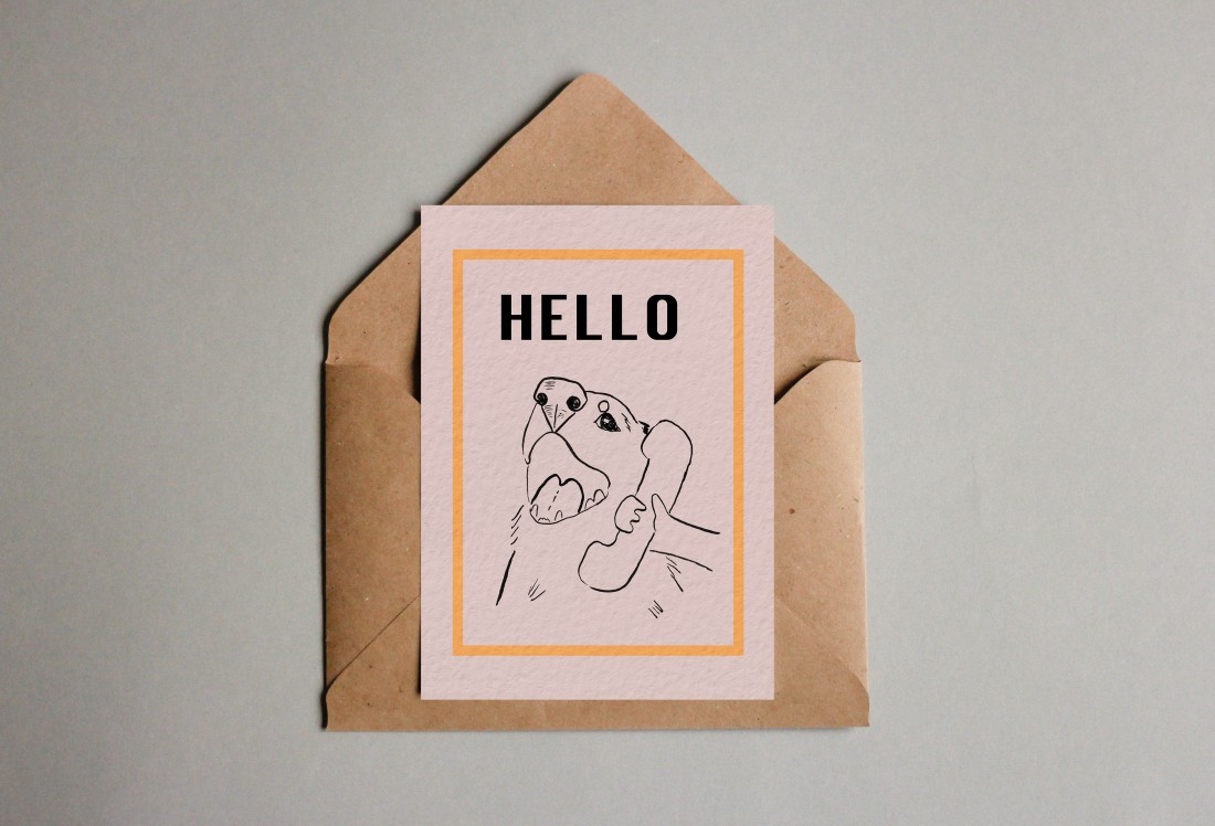
Here is the finished greetings card:
The reason I chose this image is because I love dogs (and the internet), but I also find them a challenge to draw, so I try to draw them often and in different styles. I chose pink and a kind of yellow ochre colour because I love using and mixing these two colours together. I find colour theory very interesting.
I chose to recreate the famous internet image of a dog talking on the phone:
I started with a basic outline for the draft:
Re-drew it with ink and brush, scanned it and removed the background and added the text in photoshop:
Added a digital background and border:
Then used a mockup template to show how it would work as a greetings card, as I am unable to print it and show it as a physical card.
Crude attempts to raise and lower birthrates are unlikely to produce sustainable solutions
How many children are enough? How many are too many? People’s feelings about their childhood, their partners and their jobs all shape these intimate choices. Yet in aggregate, clear patterns emerge. One of the most personal decisions a couple can make has profound repercussions for their country’s future, when it may strain resources or reduce the labour force supporting an ageing population.
This is the most common reason, though not the only one, for governments to intrude into the sex lives of their citizens. They may do so coercively, though measures such as forced sterilisation are banned under international law. They may seek to encourage procreation: Mongolia’s “First Order of Glorious Motherhood” is awarded to women who have borne six children or more.
Reports emerged last month that China is considering scrapping all limits on family size – after a more modest shift from the “one-child” policy to a universal two-child rule three years ago failed to produce the baby boom officials had sought. Though birthrates have fallen dramatically in many Asian countries, Beijing’s strict birth control policies played a major part in turning the demographic dividend, which fuelled its economic miracle, into a demographic timebomb.
Meanwhile, Egypt has declared “two is enough” as it struggles to hold back a rising birthrate. The country’s president, Abdel Fatah al-Sisi, has placed population growth on a par with terrorism as the greatest danger to the country: there are almost 105 million Egyptians already, andon current trendsthere will be 23 million more by 2030. Egypt’s slogan mimics Singapore’s “stop at two” edict in the 1970s. How much of a role the campaign played in cutting family sizes is debatable; social and economic changes certainly had a bigger impact. But the birthrate in Singaporeplummeted from 4.85 in the 1960s to 1.24 in 2015. As the government now attempts to reverse course, it has tried everything from offering cash payments for each baby and prioritised access to government-built flats to issuing pheromone-laced fragrances and arranging speed-dating events.
China isn’t handing out perfume yet. But it too is discovering that the precise factors shaping the birthrate are both hard to pin down and predict, and slow to respond to government diktat. Punishments and benefits don’t always produce the results anticipated. Handouts don’t always do much to address the broader concerns about the future, or the sense of stress and pressure in daily life, which can discourage people from having more babies. In the US, births are at a record low despite a growing number of women of childbearing age: the decline began in 2008, the year of the financial crisis.
Population matters, but panics about both low and high levels tend to be exaggerated. The former might be better addressed through measures such as immigration and increased productivity than telling people to make more babies. In the latter case, the education and empowerment of women, improved access to contraception and family planning advice (the central pillar of the Egyptian campaign) and social support (so that children aren’t the only pension and health plan on offer) are all part of the solution.
Still, Egypt might want to proceed with care. As China and Singapore have found, an apparently desirable fall in the birthrate can have unanticipated consequences. Governments are able, in the last resort and at great human cost, to enforce maximal limits. Making people have more children is trickier.
As mentioned on page 14 of the course book, I thought about the specific audience expected to view the illustration by looking at the demographics of The Guardian. This influenced the style of illustration I had in mind.
After re-reading, I have distilled the article down to this sentence: “(The governments in various countries are finding that) the precise factors shaping the birthrate are both hard to pin down and predict, and slow to respond to government diktat.”
Based on this sentence, I’m going to create an image about politicians (representing governments in general) struggling to control and balance populations.
A few ideas in a small notebookThe idea I chose, re-drawnThe final illustration
I am happy with the final illustration, originally I had planned to just use ink but I experimented with watercolour and it turned out quite well. Keeping in mind the intended audience of the article affected the style I chose for the illustration, which is more cartoon-like than I would normally choose.
The idea of the illustration as mentioned earlier is that of the ‘carrot and stick’ idea of affecting someone’s actions, but as the article mentions, these methods often have unpredictable results on the population as things tend to swing from one extreme to another.
For this exercise I decided to study E H Shepard because I grew up with Winnie the Pooh stories. I also have clear memories of my mum, who also went to art school, teaching me how to draw piglet.
I began by looking through his sketches and I was interested to find that they were so accurate with the landscapes from the ‘Hundred Acre Wood’ but he used his own son’s bear to create the character, rather than A A Milne’s son’s bear. This reminded me of the balance we need to find between reality and imagination. The bear had first appeared in the magazine ‘Punch’ for which Shepard created weekly illustrations over the course of many years. There was a hugely positive response to this particular comic which featured the bear and later A A Milne, whom Shepard had met whilst working at ‘Punch’, invited him to create the illustrations for his story.
This reminded me of two things: 1: Being aware of the response to work that we produce, and 2: networking (working for the magazine put him in touch with Milne, and still today networking is a very important part of illustration).
While studying some of Shepard’s sketches of Winnie the Pooh, I was drawn to how he was able to capture their character and gestures, without having to use many lines. It is a weakness of mine to draw too many lines so I think I will find imitating this style a bit uncomfortable, but I am excited to try it.
I used a photo of my brother’s hamster for reference and tried a few sketches in pencil before using fine liner pens to make to finished character:
Reference photo
Pencil drafts
Making the final drawing
The finished drawing
There are things I would like to fix such as the left ear and jacket collar but overall I am happy with the character, although I would have liked to have better control with the fountain pen.
My next illustration was in the style of Katie Scott. I thought her inspiration was a really interesting concept. In this video (just past minute 1) she explains that she bases her illustrations on scientific themes from ancient anatomy books before anyone really knew what was going on inside the body.
I drew a quick sketch of the hare to get an idea of the form.
Watercolour hare
Watercolour hare photoshop edit
I’m happy with the end result, although the hare’s front feet should be larger and I have the urge to go back to the purple section to match it with the digital image. I was surprised at how fiddly it was, it took quite a while to fill in. I learned a lot when painting the leaves and root system in Katie’s style, copying her use of colours has taught me a lot in a way that just looking and studying her illustrations wouldn’t have done.
There are three questions asked in the exercise:
• Did the work of the illustrator that you chose from the list seem old- fashioned? If so what was it that made it seem so?
I did feel that the illustrations had an old fashioned feel because of the style of the things drawn: style of clothing, hair, shoes and so on but the illustrations themselves are ageless- ink pens, watercolour and paper.
• What was it about the work of the contemporary artist that attracted you to their work?
As mentioned earlier, Katie Scott’s concept drawing from ancient science books was a really cool idea and her illustrations look amazing.
• How did each artist produce their illustrations – what tools and materials did they use?
E H Shepard used pen and watercolour on paper, and Katie Scott uses fine liner pens on paper, then scans them and uses photoshop to complete. She also scanned some watercolour swatches to use in photoshop as mentioned in the above video which I thought was interesting.