For this exercise I was asked to make 10 edited versions of an image by using ‘L’ shaped card to look at how cropping an image can affect the story it tells.
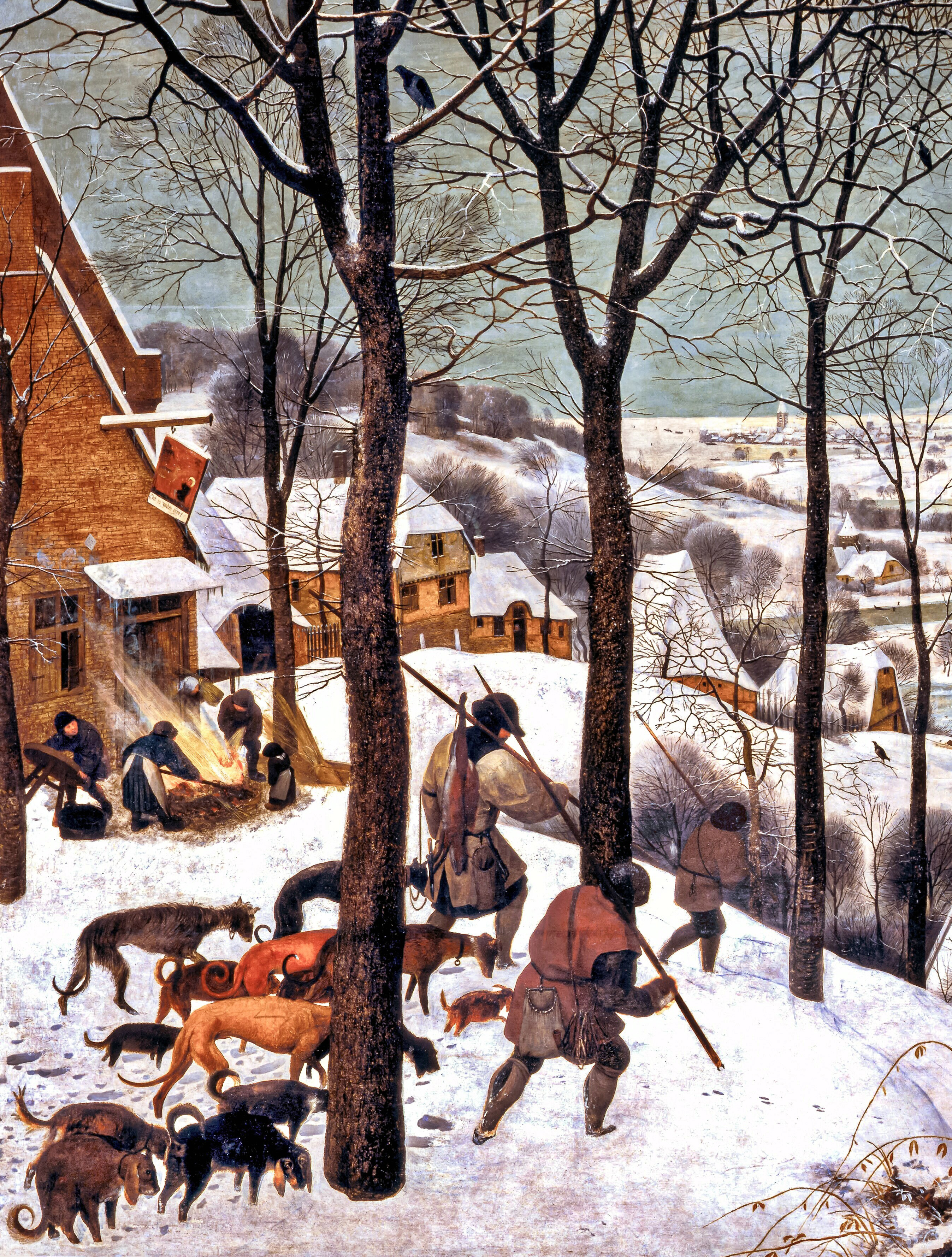
I found this image by Pieter Bruegel the Elder called Hunters in the Snow. It has so much detail and appears to show a group of hunters returning from a rather unsuccessful hunt, all looking a bit weary. As you can see the left of the image contains the foreground while the right of the image contains the background.

En.wikipedia.org. 2020. The Hunters In The Snow. [online] Available at: <https://en.wikipedia.org/wiki/The_Hunters_in_the_Snow> [Accessed 27 April 2020].
I first looked at the overall composition:

And then used the L-shaped card to study different sections of the image and cropped to make the following images below. I also have included a word with each image as instructed:


I have chosen to create an illustration on cropped image 9 “Welcome”. I think this image can easily convey a feeling of warmth and coziness on a freezing cold winter day. When I looked at this image I was reminded of the exercise ‘reading an image’, the dragon in the cave and cold colours versus warm colours and how to use textures. Looking at this image I began thinking about textures and what opportunities this image provided to use textures as I feel this is a real weak point of mine. What mark-making techniques could I use to portray various textures?
I made a list of different mark-making techniques to create suitable textures for this image:
Trees, bark, grainy – stippling, dry brush
Snow – dappling
Bricks, rough – dry brush, cross hatching
Clothing, fabric – smooth
Icicles – smooth wet look
Fire – smooth – similar to water
With these in mind I began with thumbnails:

I was happy with the first thumbnail but as I am working on experimenting and research throughout the entire project I tried a couple more and actually ended up using the third thumbnail for the final image.
I then made a draft of the full image using layout paper:

Then an ink copy on watercolour paper:

Then I scanned the image and added colour and the ‘Welcome’ text:

As you can see, I have copied a couple of figures from the original painting I was working with. I really liked how the artist used the strong contrast of the dark clothing against white snow and fire so I tried to replicate that and the interesting stances of the people. I tried to make colours cold for the outdoors and warm for the building and fire to encourage that feeling of welcoming warmth coming in from a bitterly cold day. The style I chose was entirely based on the word ‘welcome’ and what style of illustration I would expect to accompany this word. My first thought was hotels and places connected to tourism so I tried to make it light and friendly. Once I finished the colouring I then thought about the font, and googled the word welcome. I wasn’t surprised to see a lot of classical-looking fonts which did give a feeling of coziness but when I tried them on the image it looked wrong and disconnected from the image. Since the artwork itself gives me a kind of rounded bubbly kind of feeling I then tried the current font you can see in the image and found that it worked much better. I chose a warm colour again to encourage that warm feeling I want the image to convey.
Upon reflection I feel happy with the final outcome, I would have loved to experiment with oil pastels but I didn’t have the right paper that would work with it. I was also disappointed a bit with how the ink lines look against dark colours so I felt a bit restricted at times with my colour choices. Removing a white background can take time and I also missed a couple of steps in this process as it has been a while since I did this. I would have liked to try more mark-making techniques and was looking for opportunities to do so whilst making the image but the mediums I used didn’t really lend themselves to it. Besides these issues I’m happy with the outcome and how the text fits with the image. I also thought it would be nice to add a second and/or third language to the text as the word is often seen along with other languages in day-to-day life but left it off just in case.
