For this Exercise I was asked to listen to a piece of instrumental music. I chose the artist Miles Davis. I like this genre of music but I didn’t know off the top of my head any Miles Davis songs so I went to Spotify and played the first song on the top 5 list, which was Blue in Green. I listened to the other songs but found myself drawn back to this song.
Here are my first mark-making images I made whilst listening to the music:

The music quickly gave me the impression of a slow flowing river or calm waters, but the trumpet was very sharp-sounding. I used a sponge roller with black ink to make the texture in the image above to represent the kind of static noise you can hear through most of the track. Again this reminded me of a flowing river sound, like running water. Taking a step back and looking at it, the adjective I came up with was ‘slow-moving’.
I wondered what the title meant and googled it. There was a discussion on Reddit as to what it could mean that really helped:
The idea of blue and blues music being connected to feeling sad is very common, and so green makes sense to represent envy or jealousy. I felt like sharpness definitely fit in somewhere amongst the slowness and roundness of everything else.
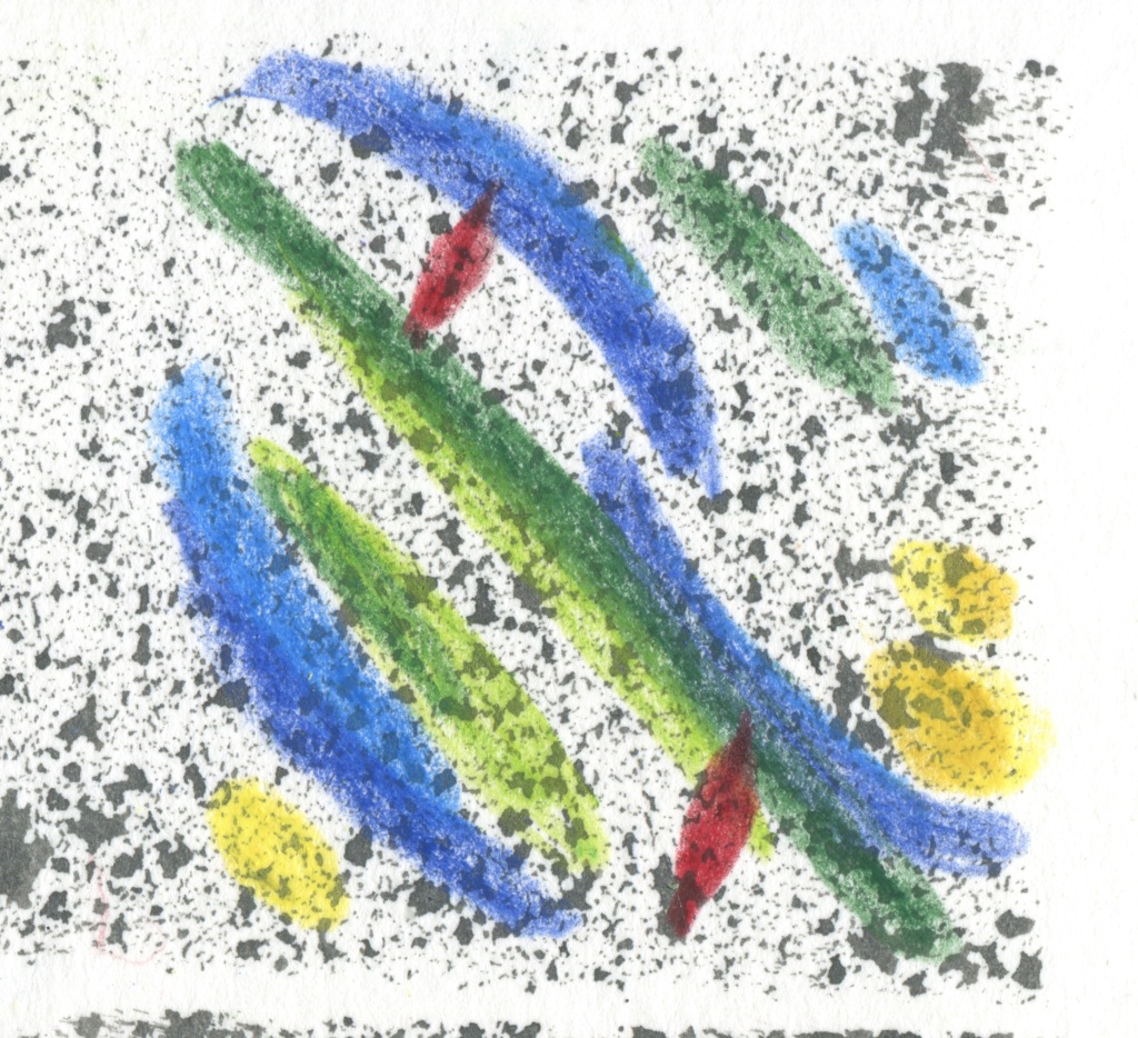
I chose this square to work with and I included some of the ink marks:

This is what I came up with whilst still listening to the music:
I then edited the image using photoshop keeping in mind the idea of it being used as a CD cover for the song:

I liked that the shapes intersected, I’m not sure how I feel about the watercolour pencil texture as it can seem a bit crayon like and I don’t know if that texture is suitable for this genre of music. Most of the album covers for this genre tend to just be a picture of the musician.
I felt that the sharp red shapes could represent pangs of pain as well as the sharpness of the trumpet sound. The green bar intersecting with them also reminds me of sheet music, as did the whole image I created before focusing in on the square section.
Listening to the music one more time after I completed this image, I feel like the music gives off a darker or dimmer atmosphere than my image does overall, maybe darker colours would have worked better.
On reflection I feel proud of this image because I was quite worried about this exercise and didn’t expect it to turn out as good as it did. The success is of course due to the guidance in the course material and I feel like I have learned a lot from this exercise. I am also aware that it kind of looks like a face. Oops.
