Exercise: Visual metaphors

For this exercise I have chosen the topic of reaching retirement.

When I started reading the material about visual metaphors I found it a bit hard to understand. Seeing a few pictures I understood the general idea but I struggled to understand a lot of the examples. Perhaps this was because they didn’t have any text with them to drive the point home. I found this article which helped a lot and explained different types very well:

Visual Metaphors: 20 Creative Ads and What You Can Learn From Them

I really liked the Tic Tac advert

tictac2.jpg


I also found this article which contains illustrations by Davide Bonazzi:

Visual metaphors: conceptual illustration by Davide Bonazzi

In the first article about adverts, a lot of them were digitally edited photos and they were very clean looking, so it was nice to see an article showing how this kind of thing can be done in different ways with illustration, too.

The best ones in my opinion are those that give you a clear message the instant you see them like this one by National Geographic, I think it’s amazing:

ng vmetaphor.jpg


I thought the idea of a spider diagram would help generate words from which I could draw the visual list:


Of course at 26 I have preconceptions about retirement from media, cliches such as cruise ship holidays and gardening, but I wanted some accurate information so I googled ‘reaching retirement’ and found a lot of the information was about money, pensions and how best to deal with the money side of things. Then I saw this article which really helped me understand a bit more from someone who had retired and experienced it first-hand:

https://www.ageuk.org.uk/information-advice/work-learning/retirement/preparing-emotionally-for-retirement/

I added some key words from this article to my spider diagram too but so far nothing clear had sprung to mind, although I liked the idea of the big contrasts such as new versus old, and the bittersweetness where you really have some negative sides and extremely positive sides to it so there are strong contrasts with this subject.

 retirement spider.png

I then began the visual list of objects and subjects:

retirement object list.png

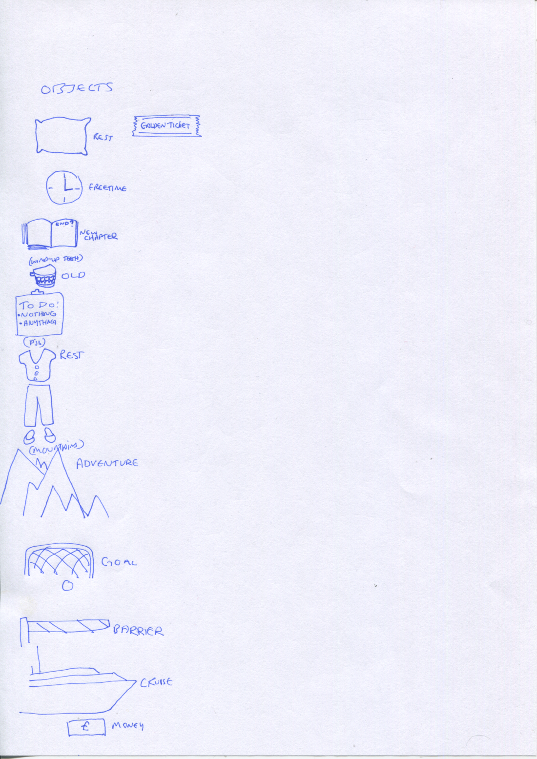
As I was making this list I realised I wanted to use objects as they were the best thing to quickly get the message across.

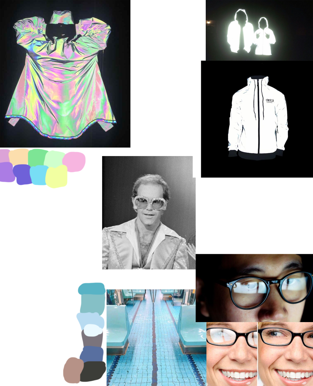
Then I produced a draft of the idea I had:reaching retirement 2.png

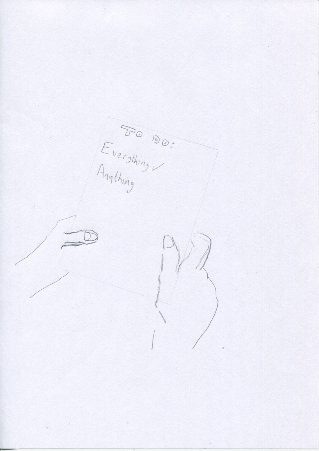
And then the final image:retirement final.png

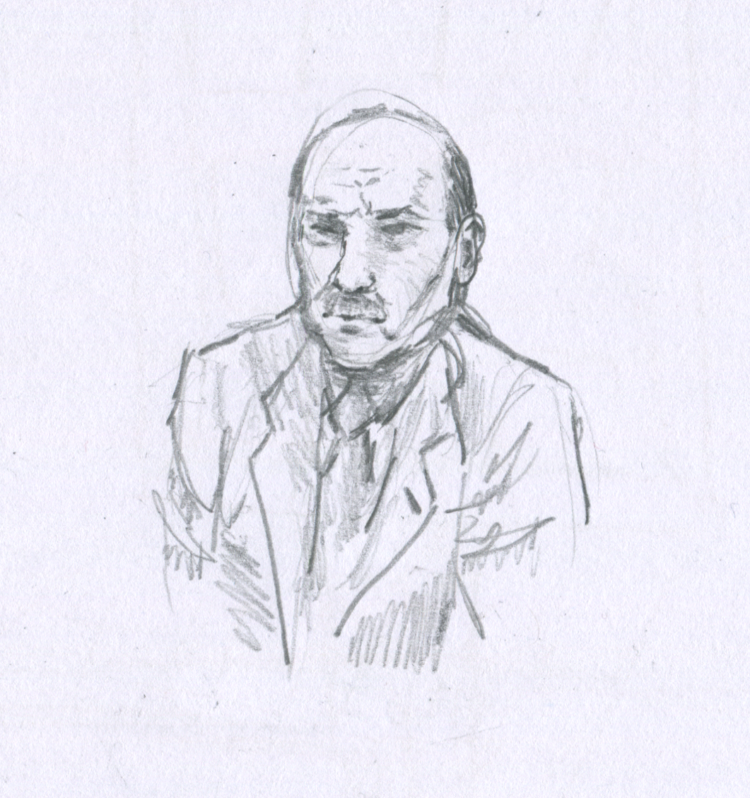
The idea being that as you are older, you have already done everything. Now, you can do anything. I felt like this captured the uncertainty and entering the unknown that is retirement. It was a really hard subject to cover! It was tempting to focus on some specific aspect of retirement but I tried to focus on the actual overall subject. I chose older looking hands to hold the paper, hopefully giving some hint as to the subject. I tested the drawings on my mum and she didn’t like this idea at all haha. I couldn’t test it on my husband as he already knew what I had chosen for my subject. I like the simplicity of it and to me, after researching the subject it makes sense but I don’t really know whether it would work for others.

Exercise: Choosing content


If this were to be made into a film what would the main character be like?

Angry, and I would say based on this part of the reading, “it was now the innermost principle of the man”, that anger would be his main quality although we know that doesn’t mean that he would be in a rage all the time. I’d say it must have been his motivating force. Other words that came to mind were silent, jaded, workaholic and serious. Food was being rationed at that time so I would give him a thin physical appearance.

What clothes would the character be wearing?

I believe the character would wear a suit because he works at Scotland Yard dealing with serious crime as opposed to being a police officer in uniform. Research on this era revealed that due to what was known as ‘austerity regulations’ because of the war, clothing -men’s fashion especially- was restricted in many ways to save on the production of material, including removal of upturned trouser cuffs, double-breasted jackets, and shirt length. The article noted however that many men got around the trouser issue by buying longer trousers and having them altered at home, so even with these restrictive measures in place, perhaps in day-to-day life we would be seeing men wearing different things to the restrictive examples photographed and presented in archives today.

I do think also that a middle-aged man might reasonably have one or two suits in his wardrobe from previous years, especially a man who would wear a suit every day, as well as ones produced in those few years of restrictions.

What furniture is in the main area in which the action takes place?

The reading mentions just a desk that he was sat at (so we can also presume he had a chair), a very sparse empty room no personal belongings and a lack of curtains. Since he deals with files I would guess  there would be files on his desk and some stationery. The desk would be wooden considering the era.

Here are the items I found for reference:

listofthings.jpg

The next task was visual brainstorming and idea generation. I noted all the adjectives in the reading:

Void, unquickened, large, empty, neutral, austere, bleak, functional. Even describing the moving shadow from the window: Idle, derelict. They are all negative. So I chose this word which captures the mood I want to convey. I associate the colour blue with this word as it is famous for its use in sad and depressing paintings, so that would be my overall colour of the image, perhaps mixed with a little yellow to make it a little grey.

negative moodboard.jpg

It was really hard to find texture and colour reference for the word ‘negative’, and I think I have a bit of a blind spot when it comes to texture so I will start working on thinking about texture more.

The ‘actor’ I chose to play the role was Clement Attlee, he has the exact face and build I was imagining. I chose this photo of him in the sunlight as he is frowning, perfect for the illustration.

39A682F200000578-3865052-image-m-39_1477268616245.jpg

Image Credit: © Popperfoto/Getty Images

I drew a quick draft:character draft2.png

An overall layout of the room, testing where he could be positioned in the room:character draft1

And then the final illustration which you can see changed quite a lot from the first layout draft:

character final.png


I enjoyed this exercise very much, it was interesting although challenging and in the end not even the desk made it into the final illustration. I was trying to include the parallelogram and trying to capture both the expression on his face and the window detail wouldn’t be possible without excluding the desk as you wouldn’t usually be sat facing with your back to the window, and if you did with that lighting it would cause a silhouette effect. I would have liked to edit it a bit but I’m satisfied with this overall. I enjoyed researching about wartime London, too.

Sources and references:

“Wartime London” – era 1939-1945

What life was like in London during WW2 – Museum of London


Clement-Attlee.jpg


Photograph By Howard Coster – found on the wikipedia page about Clement Attlee


Wartime Clothing:

iwm.org.uk/history/how-clothes-rationing-affected-fashion-in-the-second-world-war

A Decade In Fashion: The 1940’s

1940’s Office Desk:

https://www.peppermillinteriors.com/vintage-oak-desk-1940s

Desk & Chair:

https://www.ebay.co.uk/itm/vintage-home-office-desk-and-chair/164152888570?hash=item2638464cfa:g:26MAAOSw7gxeiHAa

Chair:

https://www.ebay.co.uk/itm/Vintage-1940s-Mid-Century-Solid-Oak-Brown-Faux-Leather-Office-Desk-Libary-Chair/143541021597?_trkparms=aid%3D1110007%26algo%3DHOMESPLICE.DISC%26ao%3D1%26asc%3D226201%26meid%3Dd06c3d1fc6e746b0aa5289ad63483ae3%26pid%3D100009%26rk%3D1%26rkt%3D1%26sd%3D164152888570%26itm%3D143541021597%26pmt%3D1%26noa%3D0%26pg%3D2047675%26algv%3Ddefault&_trksid=p2047675.c100009.m1982


Negative:

The Benefit of “Negative Space” in Your Storytelling

Why we should say no to positivity — and yes to our negative emotions


Exercise: Using black and white

For this exercise I chose the word ‘journey’ and brainstormed ideas using a spider diagram:

Journey spider d


I am starting to feel more comfortable using brainstorming techniques and enjoyed the method of using a spider diagram for this illustration.  It was interesting to see both a dark side and happy side to this word, depending on the reason behind the journey. Either side has quite a big reason but I suppose it takes some extraordinary circumstances to set someone on a journey as it’s not a small thing to do, but for animals it’s part of their life, like elephants, they are travel the same routes as their ancestors

I chose this image for the reference:

elephants.jpg

Here is my line work:original line work.png

Inverted:inverted line work.png

then the final step of mixing them together:journey finished product.png


I’m really happy with the end result but it took ages to complete using photoshop as I don’t have a printer and couldn’t cut the pieces physically. I enjoyed the process and I enjoyed learning to use different shapes to show form and value. I originally would have liked to use a photo of the elephants holding tails as they walked but I couldn’t find a suitable image in the end.

Elephant images I looked at for references:

  1. https://www.rd.com/culture/how-many-elephants-left-in-world/
  2. https://www.theguardian.com/environment/2008/feb/26/environment
  3. https://www.africaskysafari.com/elephants
  4. https://unsplash.com/@faxmachinerobot
  5. https://www.awf.org/blog/rare-desert-elephants-survive-namibias-harshest-drylands

Exercise: A subjective drawing

For this drawing I have chosen to use my glasses that I wear every day. I find them irritating because they get in the way and I always misplace them. I have had these glasses for a few years now so they are very familiar to me. It’ll be interesting to study them with a view to describing them subjectively for illustration.

Thinking of their particular qualities as instructed, I have made a list of subjective adjectives which stand out to me:

  1. Plastic
  2. Brown
  3. Orange
  4. Shiny
  5. Reflective
  6. Solid
  7. See-through
  8. Old
  9. Well-used
  10. Useful
  11. Smooth
  12. Simple

From this list the thing that really stands out is ‘reflective’. This is one of the things that annoys me about my glasses and glasses in general and I think for this pair it is the most dominant quality.

I googled the words ‘reflect’ and ‘reflective’.

Glass, mirrors, and water were all very closely linked together as well as the less literal meaning of reflection, meditating and thinking deeply about something. It was interesting a couple of the pictures depicting this definition used a pair of glasses in their images.

The next task is to make a moodboard. I don’t have access to any magazines for physical collaging so I have made a digital moodboard.

It looks a bit sparse but I think it perfectly sums up the idea. The first image I found was Elton John’s photo and I would have been happy if that was the whole moodboard it’s just so perfect. This is why it’s in the centre of the moodboard.

Moodboard glasses reflect(ive).png

The next task was to create a line drawing. Here is the photo of my glasses:

20200401_000802

And here is my line drawing using white pencil and fineliner pen on Strathmore Toned Tan paper. There are no drafts to upload as this was the first drawing.

glasses.png

Now for the subjective part of the drawing where I emphasise the quality of reflectiveness that stands out to me:

glasses edited.png

As you can see, I added the reflective coat image to the lenses of the glasses with a bit of opacity to show an interesting surface. The brown paper texture does nicely for the frames too.

After completing this exercise I’m feeling satisfied with the result. I would have liked the lenses to be a bit more interesting or eye-catching but there was only so much I could do whilst still keeping them looking relatively see-through. I would have also liked to add some more highlights to the frames as you can see from the photo they are quite reflective also but the lenses were the point I was focusing on so hopefully they should be the focus when others look at the picture.

One thing I wish I could have done was to use magazines to create a moodboard and use more physical materials. I think using magazines and physical materials makes the process more random and can help you more to come up with ideas.


Moodboard sources:

  1. Elton John’s glasses: https://www.rollingstone.com/music/music-news/rock-music-awards-elton-john-diana-ross-974764/
  2. Subway pool photo: https://www.instagram.com/p/B-SVl-VHfYx/?utm_source=ig_web_copy_link
  3. Glasses that reflect: https://www.allaboutvision.com/lenses/anti-reflective.htm  https://www.webmd.com/eye-health/news/20191216/do-blue-light-glasses-work
  4. Googling the word ‘reflective’
  5. reflective jacket: https://shop.dirtyworkz.com/dirty-workz-flash-reflective-jacket.html    https://www.hausoflucy.com/section839622_345740.html     https://www.aliexpress.com/i/33021043696.html

Exercise: Exploring drawing and painting

For this exercise the idea was to gather different materials together such as different kinds of papers and pens, pencils, etc. and then create the same illustration experimenting with different mediums and mark-making techniques.

Here is the picture I chose to copy:chocolate-frosted-cake-89183-2.jpg

There were a few different textures I found interesting in the photo, the icing, fruit and the inside cake itself all have very different textures so it was interesting to try.

I really felt outside of my comfort zone trying this exercise but by the end of it I felt more open-minded about testing new things rather than sticking with the methods I am comfortable with.

Here are the images I produced:

cake3
1. Graphite pencil and basic Ikea A6 notebook paper, using soft shading focusing on the icing.
cake4
2. Another cheap notebook kind of kraft paper page, using the medium of watercolour and white ink. The white in soaked and bled into the paper more than I expected. Perhaps the paper is porous.
cake2
3. Another notebook page, this time with cream paper. Graphite mechanical pencil trying to use cross-hatching and stippling.
cake1
4. This was wrapping paper from a shoe box and black ink. As you can see it really bled a lot! The paper is not so creased as it looks in this scan, I think the scanner has increased contrast on any marks.


This was an exercise which really pushed me outside my comfort zone, especially when drawing picture 3 I felt uncomfortable trying cross-hatching especially and felt that it was the wrong mark to use for such a smooth texture but I was pleasantly surprised with the result! Although I wouldn’t say it looks shiny as it does in the photo, it turned out much much better than I expected. Out of all these materials, when starting the exercise I would have guessed that image 2 would produce the best result but actually it has turned out to be one of the worser images. 

This exercise really changed my outlook on just giving things a try, you never know or can’t always predict how mediums interact with each other. I was happier than I thought I would be with the results, although I wouldn’t hang any of these pictures on my wall haha.


Exercise: An objective drawing

The instruction for this exercise was to create an objective drawing. I chose to draw a shoe, an Adidas running shoe of mine that sadly hasn’t seen much action.

It has many different textures as you can see:Adidas Trainer

I was debating which angle would best convey the form of this shoe, and so I googled Adidas running shoes to see how advertisers would display the shoe. As you can see from the image below, they mostly choose a side-on view. I found that this helps to show off the raised front of the shoe that would otherwise be unseen from other angles.


Screenshot 2020-04-01 at 00.28.58.png


I had a couple brief sketches as I was looking at the shoe to get a feel for the layout:

For some reason the scanner has emphasised any small mark and fold on the paper.

Here is the finished drawing:

trainer complete

I tried various mark-making techniques including stippling for the bottom rubber part of the shoe.

I then processed it through photoshop to create the final image:trainer complete1.png


Overall I’m happy with the final image, I really enjoyed trying different marks such as cross-hatching, stippling, soft shading to show the smoothness of certain sections of the shoe, and small soft circular motions on the laces to create that soft fibre texture. The texture for the netting material was interesting to produce, too.

The only thing I’m really not happy with is how small the final image ended up on the A4 page, I’m not sure how it managed to shrink from the first two pictures to the size it is in that last one! Of course it can be resized digitally but I will work on keeping the overall size in mind.

Project: Mark making

This project was to try stippling, crosshatching and dry-brushing.

Here are my attempts:


I wasn’t happy with the crosshatching attempt so I tried again and tried to make it neater:

crosshatching 2


I wasn’t sure where to begin with stippling, I really like the effect of stippling in drawings but I avoid it myself because I don’t have the patience for it and it gives me anxiety that I’ll make a dash rather than a dot. I found using a 0.8 pen to make the process a lot easier. I found examples of stippling, crosshatching and dry-brush exercises online and followed them:


As you can see, the dry-brush exercises didn’t make a particular shape so I chose to try a spherical shape. I found using a dry brush you could also very easily make stippling and crosshatching effects with much less effort! This was a very pleasant surprise. I wouldn’t naturally choose to use a dry-brush technique but after this exercise I think I will make use of it much more often.

Exercise: Using reference

This was a really interesting exercise and I enjoyed the research about the 50’s very much. The 50’s are interesting because there were many new trends and beginnings right across the board at the start of the decade that completely changed society in a lot of different ways in such a short time.

During the early 50’s rations were still in force in the United Kingdom as the economy was still recovering from the war, while at the same time Elizabeth was crowned as Queen. There were upheavals across the world, the Soviet Union launched the first satellite to orbit Earth, fashion was revolutionised through people like Coco Chanel and Christian Dior creating suits and the hourglass shape. Towards the end of the 50’s the world was a very different place, and it looked very different too. Abstract art became very popular with Jackson Pollock and Andy Warhol being famous household names to this day. Visually, short hair became very popular, it was the golden age of television. Celebrities such as Marilyn Monroe and James Dean were everywhere while musically speaking there were stars such as Chuck Berry and Elvis Presley, all still wildly popular today. It really was a busy era both with major events around the world and visually speaking, too.

Here is my finished illustration:

using-reference-e1576795924991.png

I tried to keep the image clear of too much clutter so that the teenager viewing the illustration could quickly pick up on the important points of the image and it wouldn’t look too busy. There is a Jackson Pollock on the wall and one of the girls is holding an Elvis record. The Queen’s coronation is on the TV. The decor in the room and the pattern on the furniture is very telling of the 1950’s era. The mother is reading the newspaper and you can see that she has the short hairstyle that was so popular in that decade.


The reference photos I used directly for this illustration:


Other images I used during research that weren’t used directly in the final illustration:


When researching this exercise I made notes directly on the course’s workbook page and created a draft of what I wanted to include in the illustation:

Overall I’m happy with the final illustration. I really enjoyed making it, as well as researching for the reference photos, too.

Exercise: Making a moodboard

I have never made a moodboard before and I don’t keep magazines because I never read them and it causes clutter, so this wasn’t the easiest exercise but from one small magazine I had about Didsbury (where I live) I managed to get a lot of travel snippets.

I put them together in the scanner in the general order I wanted them in.

Moodboard - travel
Travel

I then changed a few things in photoshop, I added some colours that were quite common throughout the board.

Moodboard - travel
Edited Moodboard


I was surprised that the colours matched up with each other quite well, the theme of different places, cultures, and people is quite clear too. I still feel that it’s a bit awkward but the main thing is that the overall theme is intact and connects very well with the previous ‘words to pictures’ exercise.

Exercise: Turning words into pictures

For this exercise I chose the word travel. I first thought about the word travel as a verb, and methods of travel, and then why people travel and what people experience when travelling. I think the word means more than just going on ‘holiday’, usually people use it when wanting to explore the world and try new things. There is an excitement about this word, it’s very active. Holiday is more relaxing, having a break from something.

The activity really helped me to distil what kinds of colours I would use and what the main feel of the word is, at least to me anyway. I also would include bright popping colours colours to convey this idea of anticipation and excitement.

Words to pictures - travel
Travel – Experiencing new things, cultures, excitement of exploration or nature and different cities