
The brief for this assignment is to design an illustration for a poster advertising a music event. I chose to design one for a pop group rather than an early music concert or jazz evening as I think there will be a lot of freedom do do a bright illustration compared to my usual ones which don’t use many strong colours.
The first step was to brainstorm and create a moodboard.
I haven’t really ever looked at a music poster before so before starting I googled the subject to see a few examples and get a better idea of this topic.
I decided on Bon Iver in the end. First I looked at their website to check out their style. I took this and their other gig posters and put them into a moodboard:

Once I had got to this stage I felt I had gathered enough data to do a spider diagram:

I then moved on to the thumbnails with the idea of nature and especially pine trees in my mind:

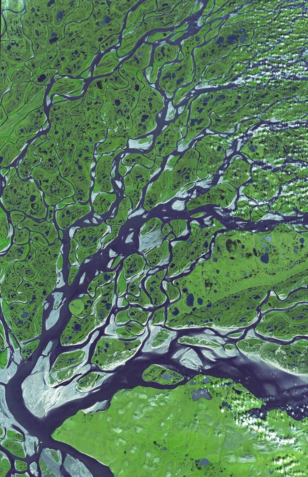
I found that the trees weren’t working for me and anything I thought of mostly had already been done with them. I chose thumbnails 8 and 11. Thumbnail 11 is of a river system.
I then researched using Google to find a good arial shot of a similar picture and found this image on the National Geographic website. The picture is from NASA.
The accompanying text is quite interesting:
A river moves more slowly as it nears its mouth, or end. The slowing velocity of the river and the build-up of sediment allows the river to break from its banks and develop new channels, called distributaries. This process is called avulsion. Here, the distributary network of the Lena River delta undergoes avulsion as it empties into the Arctic Ocean in Russia.
National Geographic
I found this subject really interesting and gave me a feel for how I would like to proceed with the illustration. So here are my two line visuals:


I wanted the river system to cover the entire page and to add the text on top so I added the text after I scanned the image using photoshop. Before completing the line visuals I favoured the leaf image but it didn’t look so interesting next to the river image so I chose to create the colour visual of the river:

I think it’s turned out ok, a few things to fix but it’s not bad. I used photoshop to add the colour. I chose the blue and green colours from the moodboard I produced earlier, but I think the blue may need to look a bit more blue as it almost looks a bit green especially in a smaller image like a phone screen. I sent it to my mum (of course) and she said it looked a bit green on her phone, too.
I also found an actual concert date for Manchester on Bon Iver’s website so I changed the date and time to match that.
In terms of title of the event, on Bon Iver’s actual concert posters they don’t give them a title so I wasn’t sure what to do about this but in the end I decided to produce another image for this option.
So let’s imagine that my mum is Bon Iver’s creative director or whoever is in charge of these designs. She sees the colour visual and says “No, it’s too green.” So I edit things again and submit my final design:

I then created an additional one with an example of where the event title could go but it looks like I have reached my upload limit for this website so I’ve had to awkwardly embed it from Flickr:

The image is in high resolution and would easily be reproduced in an A3 size. It looks more like ice this way and the water is more blue. There is more contrast which helps to draw the eye. Listening to Bon Iver’s music again whilst looking at the finished illustration, I think it matches well too.
On reflection after finishing the poster I’m much happier with this illustration than my previous assignment! It did take ages but a lot of that time was spent looking at fonts, researching and planning and downloading Photoshop brushes. I shy away from colouring using photoshop so it was a bit out of my comfort zone. I definitely felt the pinch not using a Wacom tablet and would like to invest in one for future.
Looking back on the moodboard it looks a bit basic and I could have added some outside examples of the feel rather than Bon Iver’s other concert posters.
It threw me a bit to create something whilst having what the ‘client’ would like in the back of my mind and so I focused on what they had already used. I’m not sure where the illustrator’s style and what the client wants fit together. But overall, I’m happy with the image.
