I chose ‘Making a cup of tea’ for this exercise on instructional illustrations.
I first looked around my house for reference materials. There were no illustrations on the tea boxes I had but I had this book for different kinds of coffee:
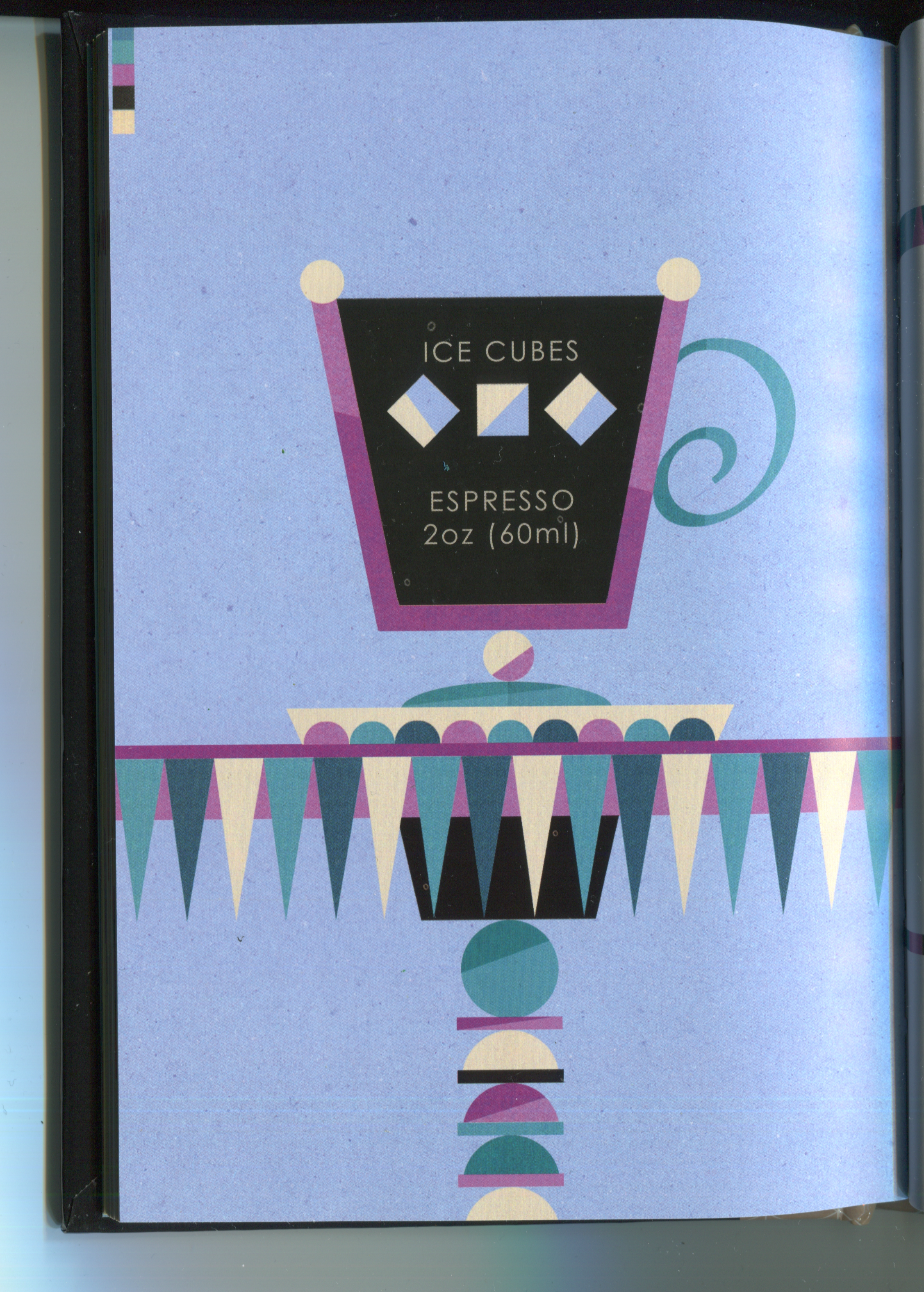


Jobst, M., n.d. Coffee Drinks. pp.50, 55, 60.
I finally have applicable reference material in my house! This is the first exercise where I actually have paper references that I can use. I like these illustrations as they are showing the coffee in a diagrammatic way and they show the temperature by use of colours and shapes. I like the simplicity and clarity of the 2D shapes.
There weren’t many illustrations available when I googled ‘how to make a cup of tea’ but there were a few in a style such as the example below:
https://www.ochaandco.com/pages/how-to-make-green-tea

The illustration above uses a nice homely style which I think is a great choice for this kind of subject. Even the background looks like tea-stained paper, and the illustrations could stand alone without text.
The information I need to impart is quite straightforward the essential things are communication that the water needs to be hot and there needs to be a teabag in the cup! Extras would be things like milk and sugar and an order to the steps. The illustration above uses 7 steps but I think we can reduce it to 3 steps at the least.
The next step was to work out how much space on the paper is needed for each step and how to display them. The course material mentioned to try as many possibilities as you can. Here are the different layouts I tried. Most of the layouts could be used to get the point across but it took a while to make a nice looking one.


I then made a final draft for the layout I wanted to use:

Drew it again on watercolour paper and used watercolour pencils but I didn’t add water to it:

I added the yellow lines next to the cup to both add feeling and aid with the composition to point towards the instructions. It crossed my mind to add writing below for the ingredients but I think people will know to use sugar rather than salt!
Finally, I edited the image in photoshop:

On reflection once I finished the image I felt like some things didn’t stand out much, such as the tea bag in the cup. I tested out a new style of marking which worked well for the water coming from the kettle but other things like the actual kettle would have benefitted from a solid colour. Even the earlier pencil image looks cleaner and easier to understand. But at the very least it gets the point across! It was an interesting process, too.
